Bottom Tabs meet Native

This is a guest post by Oskar Kwaśniewski, creator of react-native-bottom-tabs, a library exposing native tab primitives that integrates with React Navigation. If you like this guide, check out the react-native-bottom-tabs documentation for more!
This blog post will explain the differences between the JavaScript Bottom Tabs navigator and provide a step-by-step guide for integrating React Navigation with the Native Bottom Tabs Navigator.
Introduction
React Navigation comes with many navigators out of the box. We've got Stack, Native Stack, Drawer, and Bottom Tabs, but there were no Native Bottom Tabs until today!
Both Android and iOS have predefined native components for handling bottom navigation. For iOS it's SwiftUI's TabView component and for Android it's BottomNavigationView. The native approach gives us an appropriate appearance no matter the platform we are running on. Native Bottom Tabs is a navigator that wraps the native TabView and BottomNavigationView - so you can use them with React Navigation.
Let's dive into the details of this navigator.
Note: Native Bottom Tabs navigator is a standalone package, not released as part of React Navigation.
Overview
You still might be wondering the difference between @react-navigation/bottom-tabs and react-native-bottom-tabs.
Let's go over the main differences:
- JS Bottom Tabs recreate the UI as closely as possible while Native Bottom Tabs use native platform primitives to create the tabs. This makes your tab navigation indistinguishable from Native Apps as they use the same components under the hood.
- Native Bottom Tabs adapt to interfaces of a given platform for example: tvOS and visionOS show tabs as a sidebar on iPadOS they appear at the top, while JS Bottom Tabs are always at the bottom.
Distinctive features of Native Bottom Tabs
Multi-platform support
Native Bottom tabs adapt to the appearance of multiple platforms. You always get natively-looking tabs!
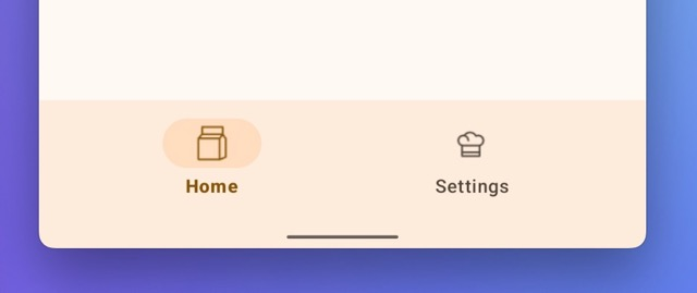
Bottom Navigation on iOS, with native blur.
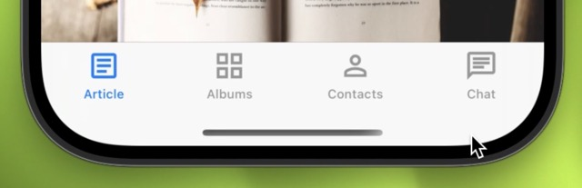
Bottom Navigation on Android, following Material Design 3 styling.

On iPadOS tabs appear at the top with a button allowing you to go into the sidebar mode.
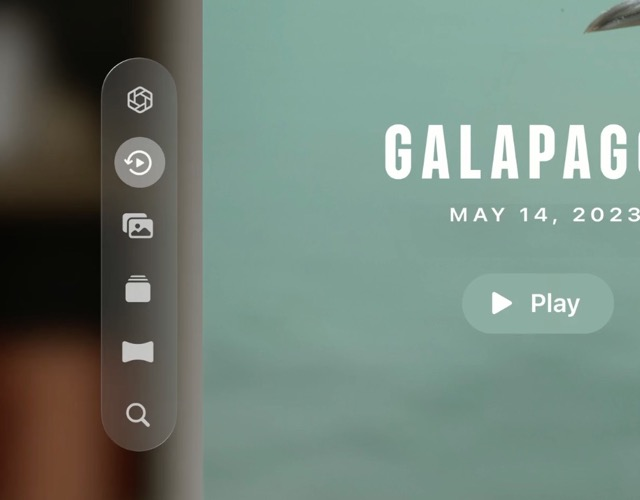
On visionOS, the tabs appear on the left side, attached outside of the window.

On tvOS tabs appear on the top, making navigation with the TV remote a breeze.

On macOS, tabs appear on the left side, following the design of the Finder app.
Automatic scroll to the top
iOS TabView automatically scrolls to the top when ScrollView is embedded inside of it.
Automatic PiP avoidance
The operating system recognizes navigation in your app making the Picture in Picture window automatically avoid bottom navigation.
Platform-specific styling
For iOS bottom navigation has a built-in blur making your app stand out. For Android, you can choose between Material 2 and Material 3 and leverage Material You system styling.
Sidebar
TabView can turn in to a side bar on tvOS, iPadOS and macOS. The sidebarAdaptable prop controls this.
Getting started
To get started follow the installation instructions in the react-native-bottom-tabs documentation.
Native Bottom Tabs Navigation resembles JavaScript Tabs API as closely as possible. Making your migration straightforward.
As mentioned before, Native Bottom Tabs use native primitives to create the tabs. This approach also has some downsides: Native components enforce certain constraints that we need to follow.
There are a few differences between the APIs worth noting. One of the biggest is how native tabs handle images. In JavaScript tabs, you can render React components as icons, in native tabs unfortunately it’s not possible. Instead, you have to provide one of the following options:
<Tab.Screen
  name="Albums"
  component={Albums}
  options={{
    tabBarIcon: () => require('person.png'),
    // SVG is also supported
    tabBarIcon: () => require('person.svg'),
    // or
    tabBarIcon: () => ({ sfSymbol: 'person' }),
    // You can also pass a URL
    tabBarIcon: () => ({ uri: 'https://example.com/icon.png' }),
  }}
/>
So if you need full customizability like providing custom tab bar icons, and advanced styling that goes beyond what’s possible with native components you should use JavaScript bottom tabs.
On top of that, the scope of this library doesn’t include the web so for that platform, you should use JavaScript Tabs.
To get started you can import createNativeBottomTabNavigator from @bottom-tabs/react-navigation and use it the same way as JavaScript Bottom Tabs.
Example usage
import { createNativeBottomTabNavigator } from '@bottom-tabs/react-navigation';

const Tabs = createNativeBottomTabNavigator();

function NativeBottomTabs() {
  return (
    <Tabs.Navigator>
      <Tabs.Screen
        name="index"
        options={{
          title: 'Home',
          tabBarIcon: () => ({ uri: 'https://example.com/icon.png' }),
        }}
      />
      <Tabs.Screen
        name="explore"
        options={{
          title: 'Explore',
          tabBarIcon: () => ({ uri: 'https://example.com/icon.png' }),
        }}
      />
    </Tabs.Navigator>
  );
}

You can check out the project here.
Thanks for reading!