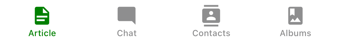
Bottom Tabs Navigator
A simple tab bar on the bottom of the screen that lets you switch between different routes. Routes are lazily initialized -- their screen components are not mounted until they are first focused.
Installation
To use this navigator, ensure that you have @react-navigation/native and its dependencies (follow this guide), then install @react-navigation/bottom-tabs:
- npm
- Yarn
- pnpm
npm install @react-navigation/bottom-tabs
yarn add @react-navigation/bottom-tabs
pnpm add @react-navigation/bottom-tabs
Usage
To use this navigator, import it from @react-navigation/bottom-tabs:
- Static
- Dynamic
import { createBottomTabNavigator } from '@react-navigation/bottom-tabs';

const MyTabs = createBottomTabNavigator({
  screens: {
    Home: HomeScreen,
    Profile: ProfileScreen,
  },
});
import { createBottomTabNavigator } from '@react-navigation/bottom-tabs';

const Tab = createBottomTabNavigator();

function MyTabs() {
  return (
    <Tab.Navigator>
      <Tab.Screen name="Home" component={HomeScreen} />
      <Tab.Screen name="Profile" component={ProfileScreen} />
    </Tab.Navigator>
  );
}
API Definition
Props
In addition to the common props shared by all navigators, the bottom tab navigator accepts the following additional props:
backBehavior
This controls what happens when goBack is called in the navigator. This includes pressing the device's back button or back gesture on Android.
It supports the following values:
firstRoute- return to the first screen defined in the navigator (default)initialRoute- return to initial screen passed ininitialRouteNameprop, if not passed, defaults to the first screenorder- return to screen defined before the focused screenhistory- return to last visited screen in the navigator; if the same screen is visited multiple times, the older entries are dropped from the historyfullHistory- return to last visited screen in the navigator; doesn't drop duplicate entries unlikehistory- this behavior is useful to match how web pages worknone- do not handle back button
detachInactiveScreens
Boolean used to indicate whether inactive screens should be detached from the view hierarchy to save memory. This enables integration with react-native-screens. Defaults to true.
tabBar
Function that returns a React element to display as the tab bar.
The function receives an object containing the following properties as the argument:
state- The state object for the tab navigator.descriptors- The descriptors object containing options for the tab navigator.navigation- The navigation object for the tab navigator.
The state.routes array contains all the routes defined in the navigator. Each route's options can be accessed using descriptors[route.key].options.
Example:
- Static
- Dynamic
import { View, Platform } from 'react-native';
import { useLinkBuilder, useTheme } from '@react-navigation/native';
import { Text, PlatformPressable } from '@react-navigation/elements';
import { createBottomTabNavigator } from '@react-navigation/bottom-tabs';

function MyTabBar({ state, descriptors, navigation }) {
  const { colors } = useTheme();
  const { buildHref } = useLinkBuilder();

  return (
    <View style={{ flexDirection: 'row' }}>
      {state.routes.map((route, index) => {
        const { options } = descriptors[route.key];
        const label =
          options.tabBarLabel !== undefined
            ? options.tabBarLabel
            : options.title !== undefined
              ? options.title
              : route.name;

        const isFocused = state.index === index;

        const onPress = () => {
          const event = navigation.emit({
            type: 'tabPress',
            target: route.key,
            canPreventDefault: true,
          });

          if (!isFocused && !event.defaultPrevented) {
            navigation.navigate(route.name, route.params);
          }
        };

        const onLongPress = () => {
          navigation.emit({
            type: 'tabLongPress',
            target: route.key,
          });
        };

        return (
          <PlatformPressable
            href={buildHref(route.name, route.params)}
            accessibilityState={isFocused ? { selected: true } : {}}
            accessibilityLabel={options.tabBarAccessibilityLabel}
            testID={options.tabBarButtonTestID}
            onPress={onPress}
            onLongPress={onLongPress}
            style={{ flex: 1 }}
          >
            <Text style={{ color: isFocused ? colors.primary : colors.text }}>
              {label}
            </Text>
          </PlatformPressable>
        );
      })}
    </View>
  );
}

const MyTabs = createBottomTabNavigator({
  tabBar: (props) => <MyTabBar {...props} />,
  screens: {
    Home: HomeScreen,
    Profile: ProfileScreen,
  },
});
import { View, Platform } from 'react-native';
import { useLinkBuilder, useTheme } from '@react-navigation/native';
import { Text, PlatformPressable } from '@react-navigation/elements';
import { createBottomTabNavigator } from '@react-navigation/bottom-tabs';

function MyTabBar({ state, descriptors, navigation }) {
  const { colors } = useTheme();
  const { buildHref } = useLinkBuilder();

  return (
    <View style={{ flexDirection: 'row' }}>
      {state.routes.map((route, index) => {
        const { options } = descriptors[route.key];
        const label =
          options.tabBarLabel !== undefined
            ? options.tabBarLabel
            : options.title !== undefined
              ? options.title
              : route.name;

        const isFocused = state.index === index;

        const onPress = () => {
          const event = navigation.emit({
            type: 'tabPress',
            target: route.key,
            canPreventDefault: true,
          });

          if (!isFocused && !event.defaultPrevented) {
            navigation.navigate(route.name, route.params);
          }
        };

        const onLongPress = () => {
          navigation.emit({
            type: 'tabLongPress',
            target: route.key,
          });
        };

        return (
          <PlatformPressable
            href={buildHref(route.name, route.params)}
            accessibilityState={isFocused ? { selected: true } : {}}
            accessibilityLabel={options.tabBarAccessibilityLabel}
            testID={options.tabBarButtonTestID}
            onPress={onPress}
            onLongPress={onLongPress}
            style={{ flex: 1 }}
          >
            <Text style={{ color: isFocused ? colors.primary : colors.text }}>
              {label}
            </Text>
          </PlatformPressable>
        );
      })}
    </View>
  );
}

function MyTabs() {
  return (
    <Tab.Navigator
      tabBar={(props) => <MyTabBar {...props} />}
    >
      <Tab.Screen name="Home" component={HomeScreen} />
      <Tab.Screen name="Profile" component={ProfileScreen} />
    </Tab.Navigator>
  );
}
This example will render a basic tab bar with labels.
Note that you cannot use the useNavigation hook inside the tabBar since useNavigation is only available inside screens. You get a navigation prop for your tabBar which you can use instead:
function MyTabBar({ navigation }) {
  return (
    <Button
      onPress={() => {
        // Navigate using the `navigation` prop that you received
        navigation.navigate('SomeScreen');
      }}
    >
      Go somewhere
    </Button>
  );
}
Options
The following options can be used to configure the screens in the navigator. These can be specified under screenOptions prop of Tab.navigator or options prop of Tab.Screen.
title
Generic title that can be used as a fallback for headerTitle and tabBarLabel.
tabBarLabel
Title string of a tab displayed in the tab bar or a function that given { focused: boolean, color: string } returns a React.Node, to display in tab bar. When undefined, scene title is used. To hide, see tabBarShowLabel.
tabBarShowLabel
Whether the tab label should be visible. Defaults to true.
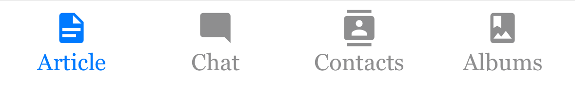
tabBarLabelPosition
Whether the label is shown below the icon or beside the icon.
By default, the position is chosen automatically based on device width.
-
below-icon: the label is shown below the icon (typical for iPhones)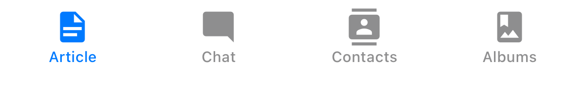
-
beside-iconthe label is shown next to the icon (typical for iPad)
tabBarLabelStyle
Style object for the tab label.
Example:
    tabBarLabelStyle: {
      fontSize: 16,
      fontFamily: 'Georgia',
      fontWeight: 300,
    },
tabBarIcon
Function that given { focused: boolean, color: string, size: number } returns a React.Node, to display in the tab bar.
tabBarIconStyle
Style object for the tab icon.
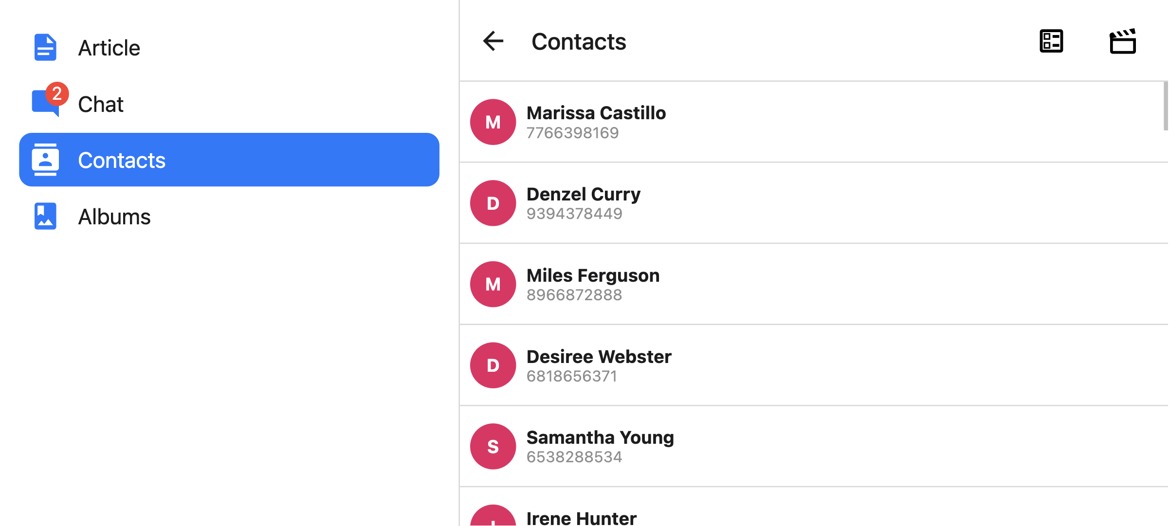
tabBarBadge
Text to show in a badge on the tab icon. Accepts a string or a number.
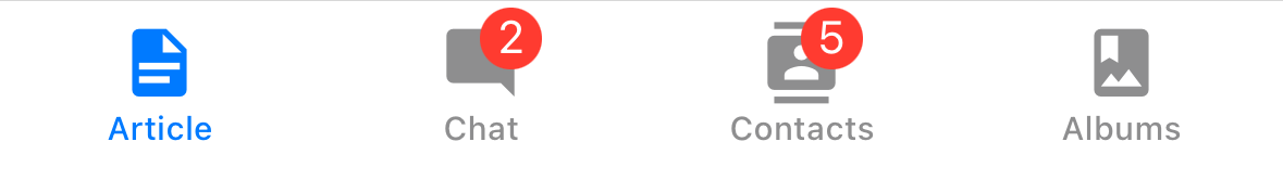
tabBarBadgeStyle
Style for the badge on the tab icon. You can specify a background color or text color here.
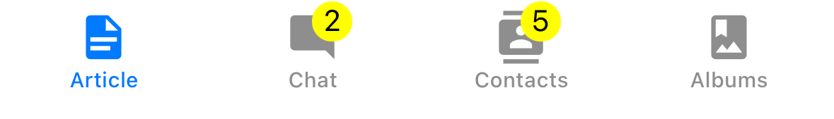
Example:
    tabBarBadgeStyle: {
      color: 'black',
      backgroundColor: 'yellow',
    },
tabBarAccessibilityLabel
Accessibility label for the tab button. This is read by the screen reader when the user taps the tab. It's recommended to set this if you don't have a label for the tab.
tabBarButton
Function which returns a React element to render as the tab bar button. It wraps the icon and label. Renders Pressable by default.
You can specify a custom implementation here:
tabBarButton: (props) => <TouchableOpacity {...props} />;
tabBarButtonTestID
ID to locate this tab button in tests.
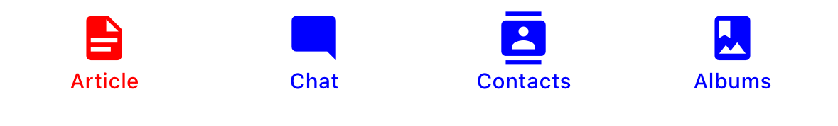
tabBarActiveTintColor
Color for the icon and label in the active tab.
tabBarInactiveTintColor
Color for the icon and label in the inactive tabs.
tabBarActiveBackgroundColor
Background color for the active tab.
tabBarInactiveBackgroundColor
Background color for the inactive tabs.
tabBarHideOnKeyboard
Whether the tab bar is hidden when the keyboard opens. Defaults to false.
tabBarItemStyle
Style object for the tab item container.
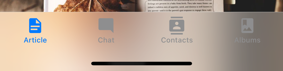
tabBarStyle
Style object for the tab bar. You can configure styles such as background color here.
To show your screen under the tab bar, you can set the position style to absolute:
<Tab.Navigator
  screenOptions={{
    tabBarStyle: { position: 'absolute' },
  }}
>
You also might need to add a bottom margin to your content if you have an absolutely positioned tab bar. React Navigation won't do it automatically. See useBottomTabBarHeight for more details.
tabBarBackground
Function which returns a React Element to use as background for the tab bar. You could render an image, a gradient, blur view etc.:
import { BlurView } from 'expo-blur';

// ...

<Tab.Navigator
  screenOptions={{
    tabBarStyle: { position: 'absolute' },
    tabBarBackground: () => (
      <BlurView tint="light" intensity={100} style={StyleSheet.absoluteFill} />
    ),
  }}
>
When using BlurView, make sure to set position: 'absolute' in tabBarStyle as well. You'd also need to use useBottomTabBarHeight to add bottom padding to your content.
tabBarPosition
Position of the tab bar. Available values are:
bottom(Default)topleftright
When the tab bar is positioned on the left or right, it is styled as a sidebar. This can be useful when you want to show a sidebar on larger screens and a bottom tab bar on smaller screens:
- Static
- Dynamic
const Tabs = createBottomTabNavigator({
  screenOptions: {
    tabBarPosition: isLargeScreen ? 'left' : 'bottom',
  },

  // ...
});
<Tab.Navigator
  screenOptions={{
    tabBarPosition: isLargeScreen ? 'left' ? 'bottom',
  }}
>
You can also render a compact sidebar by placing the label below the icon. This is only supported when the tabBarVariant is set to material:
- Static
- Dynamic
const Tabs = createBottomTabNavigator({
  screenOptions: {
    tabBarPosition: isLargeScreen ? 'left' ? 'bottom',
    tabBarVariant: isLargeScreen ? 'material' : 'uikit',
    tabBarLabelPosition: 'below-icon',
  },

  // ...
});
<Tab.Navigator
  screenOptions={{
    tabBarPosition: dimensions.width < 600 ? 'bottom' : 'left',
    tabBarLabelPosition: 'below-icon',
  }}
>
tabBarVariant
Variant of the tab bar. Available values are:
uikit(Default) - The tab bar will be styled according to the iOS UIKit guidelines.material- The tab bar will be styled according to the Material Design guidelines.
The material variant is currently only supported when the tabBarPosition is set to left or right.
lazy
Whether this screen should render only after the first time it's accessed. Defaults to true. Set it to false if you want to render the screen on the initial render of the navigator.
freezeOnBlur
Boolean indicating whether to prevent inactive screens from re-rendering. Defaults to false.
Defaults to true when enableFreeze() from react-native-screens package is run at the top of the application.
Only supported on iOS and Android.
popToTopOnBlur
Boolean indicating whether any nested stack should be popped to the top of the stack when navigating away from this tab. Defaults to false.
It only works when there is a stack navigator (e.g. stack navigator or native stack navigator) nested under the tab navigator.
sceneStyle
Style object for the component wrapping the screen content.
Header related options
You can find the list of header related options here. These options can be specified under screenOptions prop of Tab.navigator or options prop of Tab.Screen. You don't have to be using @react-navigation/elements directly to use these options, they are just documented in that page.
In addition to those, the following options are also supported in bottom tabs:
header
Custom header to use instead of the default header.
This accepts a function that returns a React Element to display as a header. The function receives an object containing the following properties as the argument:
navigation- The navigation object for the current screen.route- The route object for the current screen.options- The options for the current screenlayout- Dimensions of the screen, containsheightandwidthproperties.
Example:
import { getHeaderTitle } from '@react-navigation/elements';

// ..

header: ({ navigation, route, options }) => {
  const title = getHeaderTitle(options, route.name);

  return <MyHeader title={title} style={options.headerStyle} />;
};
To set a custom header for all the screens in the navigator, you can specify this option in the screenOptions prop of the navigator.
Specify a height in headerStyle
If your custom header's height differs from the default header height, then you might notice glitches due to measurement being async. Explicitly specifying the height will avoid such glitches.
Example:
headerStyle: {
  height: 80, // Specify the height of your custom header
};
Note that this style is not applied to the header by default since you control the styling of your custom header. If you also want to apply this style to your header, use options.headerStyle from the props.
headerShown
Whether to show or hide the header for the screen. The header is shown by default. Setting this to false hides the header.
Events
The navigator can emit events on certain actions. Supported events are:
tabPress
This event is fired when the user presses the tab button for the current screen in the tab bar. By default a tab press does several things:
- If the tab is not focused, tab press will focus that tab
- If the tab is already focused:
- If the screen for the tab renders a scroll view, you can use
useScrollToTopto scroll it to top - If the screen for the tab renders a stack navigator, a
popToTopaction is performed on the stack
- If the screen for the tab renders a scroll view, you can use
To prevent the default behavior, you can call event.preventDefault:
React.useEffect(() => {
  const unsubscribe = navigation.addListener('tabPress', (e) => {
    // Prevent default behavior
    e.preventDefault();

    // Do something manually
    // ...
  });

  return unsubscribe;
}, [navigation]);
If you have a custom tab bar, make sure to emit this event.
tabLongPress
This event is fired when the user presses the tab button for the current screen in the tab bar for an extended period. If you have a custom tab bar, make sure to emit this event.
Example:
React.useEffect(() => {
  const unsubscribe = navigation.addListener('tabLongPress', (e) => {
    // Do something
  });

  return unsubscribe;
}, [navigation]);
Helpers
The tab navigator adds the following methods to the navigation object:
jumpTo
Navigates to an existing screen in the tab navigator. The method accepts following arguments:
name- string - Name of the route to jump to.params- object - Screen params to use for the destination route.
navigation.jumpTo('Profile', { owner: 'Michaś' });
Hooks
The bottom tab navigator exports the following hooks:
useBottomTabBarHeight
This hook returns the height of the bottom tab bar. By default, the screen content doesn't go under the tab bar. However, if you want to make the tab bar absolutely positioned and have the content go under it (e.g. to show a blur effect), it's necessary to adjust the content to take the tab bar height into account.
Example:
import { useBottomTabBarHeight } from '@react-navigation/bottom-tabs';

function MyComponent() {
  const tabBarHeight = useBottomTabBarHeight();

  return (
    <ScrollView contentStyle={{ paddingBottom: tabBarHeight }}>
      {/* Content */}
    </ScrollView>
  );
}
Alternatively, you can use the BottomTabBarHeightContext directly if you are using a class component or need it in a reusable component that can be used outside the bottom tab navigator:
import { BottomTabBarHeightContext } from '@react-navigation/bottom-tabs';

// ...

<BottomTabBarHeightContext.Consumer>
  {tabBarHeight => (
    /* render something */
  )}
</BottomTabBarHeightContext.Consumer>
Animations
By default, switching between tabs doesn't have any animation. You can specify the animation option to customize the transition animation.
Supported values for animation are:
-
fade- Cross-fade animation for the screen transition where the new screen fades in and the old screen fades out. -
shift- Shifting animation for the screen transition where the screens slightly shift to left/right. -
none- The screen transition doesn't have any animation. This is the default value.
- Static
- Dynamic
const RootTabs = createBottomTabNavigator({
  screenOptions: {
    animation: 'fade',
  },
  screens: {
    Home: HomeScreen,
    Profile: ProfileScreen,
  },
});
function RootTabs() {
  return (
    <Tab.Navigator
      screenOptions={{
        animation: 'fade',
      }}
    >
      <Tab.Screen name="Home" component={HomeScreen} />
      <Tab.Screen name="Profile" component={ProfileScreen} />
    </Tab.Navigator>
  );
}
If you need more control over the animation, you can customize individual parts of the animation using the various animation-related options:
Animation related options
Bottom Tab Navigator exposes various options to configure the transition animation when switching tabs. These transition animations can be customized on a per-screen basis by specifying the options in the options for each screen, or for all screens in the tab navigator by specifying them in the screenOptions.
-
transitionSpec- An object that specifies the animation type (timingorspring) and its options (such asdurationfortiming). It contains 2 properties:animation- The animation function to use for the animation. Supported values aretimingandspring.config- The configuration object for the timing function. Fortiming, it can bedurationandeasing. Forspring, it can bestiffness,damping,mass,overshootClamping,restDisplacementThresholdandrestSpeedThreshold.
A config that uses a timing animation looks like this:
const config = {
  animation: 'timing',
  config: {
    duration: 150,
    easing: Easing.inOut(Easing.ease),
  },
};
We can pass this config in the
transitionSpecoption:- Static
- Dynamic
{
  Profile: {
    screen: Profile,
    options: {
      transitionSpec: {
        animation: 'timing',
        config: {
          duration: 150,
          easing: Easing.inOut(Easing.ease),
        },
      },
    },
  },
}<Tab.Screen
name="Profile"
component={Profile}
options={{
transitionSpec: {
animation: 'timing',
config: {
duration: 150,
easing: Easing.inOut(Easing.ease),
},
},
}}
/> -
sceneStyleInterpolator- This is a function that specifies interpolated styles for various parts of the scene. It currently supports style for the view containing the screen:sceneStyle- Style for the container view wrapping the screen content.
The function receives the following properties in its argument:
current- Animation values for the current screen:progress- Animated node representing the progress value of the current screen.
A config that fades the screen looks like this:
const forFade = ({ current }) => ({
  sceneStyle: {
    opacity: current.progress.interpolate({
      inputRange: [-1, 0, 1],
      outputRange: [0, 1, 0],
    }),
  },
});
The value of
current.progressis as follows:- -1 if the index is lower than the active tab,
- 0 if they're active,
- 1 if the index is higher than the active tab
We can pass this function in
sceneStyleInterpolatoroption:- Static
- Dynamic
{
  Profile: {
    screen: Profile,
    options: {
      sceneStyleInterpolator: ({ current }) => ({
        sceneStyle: {
          opacity: current.progress.interpolate({
            inputRange: [-1, 0, 1],
            outputRange: [0, 1, 0],
          }),
        },
      }),
    },
  },
}<Tab.Screen
name="Profile"
component={Profile}
options={{
sceneStyleInterpolator: ({ current }) => ({
sceneStyle: {
opacity: current.progress.interpolate({
inputRange: [-1, 0, 1],
outputRange: [0, 1, 0],
}),
},
}),
}}
/>
Putting these together, you can customize the transition animation for a screen:
- Static
- Dynamic
const RootTabs = createBottomTabNavigator({
  screenOptions: {
    transitionSpec: {
      animation: 'timing',
      config: {
        duration: 150,
        easing: Easing.inOut(Easing.ease),
      },
    },
    sceneStyleInterpolator: ({ current }) => ({
      sceneStyle: {
        opacity: current.progress.interpolate({
          inputRange: [-1, 0, 1],
          outputRange: [0, 1, 0],
        }),
      },
    }),
  },
  screens: {
    Home: HomeScreen,
    Profile: ProfileScreen,
  },
});
function RootTabs() {
  return (
    <Tab.Navigator
      screenOptions={{
        transitionSpec: {
          animation: 'timing',
          config: {
            duration: 150,
            easing: Easing.inOut(Easing.ease),
          },
        },
        sceneStyleInterpolator: ({ current }) => ({
          sceneStyle: {
            opacity: current.progress.interpolate({
              inputRange: [-1, 0, 1],
              outputRange: [0, 1, 0],
            }),
          },
        }),
      }}
    >
      <Tab.Screen name="Home" component={HomeScreen} />
      <Tab.Screen name="Profile" component={ProfileScreen} />
    </Tab.Navigator>
  );
}
Pre-made configs
We also export various configs from the library with ready-made configs that you can use to customize the animations:
TransitionSpecs
FadeSpec- Configuration for a cross-fade animation between screens.ShiftSpec- Configuration for a shifting animation between screens.
Example:
- Static
- Dynamic
import { TransitionSpecs } from '@react-navigation/bottom-tabs';

// ...

{
  Profile: {
    screen: Profile,
    options: {
      transitionSpec: TransitionSpecs.CrossFadeSpec,
    },
  },
}
import { TransitionSpecs } from '@react-navigation/bottom-tabs';

// ...

<Tab.Screen
  name="Profile"
  component={Profile}
  options={{
    transitionSpec: TransitionSpecs.FadeSpec,
  }}
/>;
SceneStyleInterpolators
forFade- Cross-fade animation for the screen transition where the new screen fades in and the old screen fades out.forShift- Shifting animation for the screen transition where the screens slightly shift to left/right.
Example:
- Static
- Dynamic
import { SceneStyleInterpolators } from '@react-navigation/bottom-tabs';

// ...

{
  Profile: {
    screen: Profile,
    options: {
      sceneStyleInterpolator: SceneStyleInterpolators.forFade,
    },
  },
}
import { SceneStyleInterpolators } from '@react-navigation/bottom-tabs';

// ...

<Tab.Screen
  name="Profile"
  component={Profile}
  options={{
    sceneStyleInterpolator: SceneStyleInterpolators.forFade,
  }}
/>;
TransitionPresets
We export transition presets that bundle various sets of these options together. A transition preset is an object containing a few animation-related screen options exported under TransitionPresets. Currently the following presets are available:
FadeTransition- Cross-fade animation for the screen transition where the new screen fades in and the old screen fades out.ShiftTransition- Shifting animation for the screen transition where the screens slightly shift to left/right.
You can spread these presets in options to customize the animation for a screen:
Example:
- Static
- Dynamic
import { TransitionPresets } from '@react-navigation/bottom-tabs';

// ...

{
  Profile: {
    screen: Profile,
    options: {
      ...TransitionPresets.FadeTransition,
    },
  },
}
import { TransitionPresets } from '@react-navigation/bottom-tabs';

// ...

<Tab.Screen
  name="Profile"
  component={Profile}
  options={{
    ...TransitionPresets.FadeTransition,
  }}
/>;