Header buttons
Now that we know how to customize the look of our headers, let's make them sentient! Actually perhaps that's ambitious, let's just make them able to respond to our touches in very well-defined ways.
Adding a button to the header
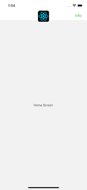
The most common way to interact with a header is by tapping on a button either to the left or the right of the title. Let's add a button to the right side of the header (one of the most difficult places to touch on your entire screen, depending on finger and phone size, but also a normal place to put buttons).
- Static
- Dynamic
const MyStack = createNativeStackNavigator({
  screens: {
    Home: {
      screen: HomeScreen,
      options: {
        headerRight: () => (
          <Button onPress={() => alert('This is a button!')}>Info</Button>
        ),
      },
    },
  },
});
function MyStack() {
  return (
    <Stack.Navigator>
      <Stack.Screen
        name="Home"
        component={HomeScreen}
        options={{
          headerRight: () => (
            <Button onPress={() => alert('This is a button!')}>Info</Button>
          ),
        }}
      />
    </Stack.Navigator>
  );
}
When we define our button this way, the this variable in options is not the HomeScreen instance, so you can't call setState or any instance methods on it. This is pretty important because it's common to want the buttons in your header to interact with the screen that the header belongs to. So, we will look how to do this next.
Note that a community-developed library for rendering buttons in the header with the correct styling is available: react-navigation-header-buttons.
Header interaction with its screen component
In some cases, components in the header need to interact with the screen component. For this use case, we need to use navigation.setOptions to update our options. By using navigation.setOptions inside the screen component, we get access to screen's props, state, context etc.
- Static
- Dynamic
function HomeScreen() {
  const navigation = useNavigation();
  const [count, setCount] = React.useState(0);

  React.useEffect(() => {
    // Use `setOptions` to update the button that we previously specified
    // Now the button includes an `onPress` handler to update the count
    navigation.setOptions({
      headerRight: () => (
        <Button onPress={() => setCount((c) => c + 1)}>Update count</Button>
      ),
    });
  }, [navigation]);

  return <Text>Count: {count}</Text>;
}

const MyStack = createNativeStackNavigator({
  screens: {
    Home: {
      screen: HomeScreen,
      options: {
        // Add a placeholder button without the `onPress` to avoid flicker
        headerRight: () => <Button>Update count</Button>,
      },
    },
  },
});
function HomeScreen() {
  const navigation = useNavigation();
  const [count, setCount] = React.useState(0);

  React.useEffect(() => {
    // Use `setOptions` to update the button that we previously specified
    // Now the button includes an `onPress` handler to update the count
    navigation.setOptions({
      headerRight: () => (
        <Button onPress={() => setCount((c) => c + 1)}>Update count</Button>
      ),
    });
  }, [navigation]);

  return <Text>Count: {count}</Text>;
}

function MyStack() {
  return (
    <Stack.Navigator>
      <Stack.Screen
        name="Home"
        component={HomeScreen}
        options={{
          // Add a placeholder button without the `onPress` to avoid flicker
          headerRight: () => <Button>Update count</Button>,
        }}
      />
    </Stack.Navigator>
  );
}
Here we update the headerRight with a button with onPress handler that has access to the component's state and can update it.
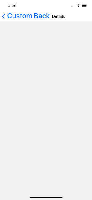
Customizing the back button
createNativeStackNavigator provides the platform-specific defaults for the back button. On iOS this includes a label next to the button, which shows the title of the previous screen when the title fits in the available space, otherwise it says "Back".
You can change the label behavior with headerBackTitle and style it with headerBackTitleStyle (read more).
To customize the back button image, you can use headerBackImageSource (read more).
- Static
- Dynamic
const MyStack = createNativeStackNavigator({
  screens: {
    Home: {
      screen: HomeScreen,
      options: {
        headerBackTitle: 'Custom Back',
        headerBackTitleStyle: { fontSize: 30 },
      },
    },
  },
});
<Stack.Navigator>
  <Stack.Screen name="Home" component={HomeScreen} />
  <Stack.Screen
    name="Details"
    component={DetailsScreen}
    options={{
      headerBackTitle: 'Custom Back',
      headerBackTitleStyle: { fontSize: 30 },
    }}
  />
</Stack.Navigator>
Overriding the back button
The back button will be rendered automatically in a stack navigator whenever it is possible for the user to go back from their current screen — in other words, the back button will be rendered whenever there is more than one screen in the stack.
Generally, this is what you want. But it's possible that in some circumstances that you want to customize the back button more than you can through the options mentioned above, in which case you can set the headerLeft option to a React Element that will be rendered, just as we did with headerRight. Alternatively, the headerLeft option also accepts a React Component, which can be used, for example, for overriding the onPress behavior of the back button. Read more about this in the api reference.
Summary
- You can set buttons in the header through the
headerLeftandheaderRightproperties inoptions. - The back button is fully customizable with
headerLeft, but if you only want to change the title or image, there are otheroptionsfor that —headerBackTitle,headerBackTitleStyle, andheaderBackImageSource. - You can use a callback for the options prop to access
navigationandrouteobjects.