Native Stack Navigator
Native Stack Navigator provides a way for your app to transition between screens where each new screen is placed on top of a stack.
This navigator uses the native APIs UINavigationController on iOS and Fragment on Android so that navigation built with createNativeStackNavigator will behave exactly the same and have the same performance characteristics as apps built natively on top of those APIs. It also offers basic Web support using react-native-web.
One thing to keep in mind is that while @react-navigation/native-stack offers native performance and exposes native features such as large title on iOS etc., it may not be as customizable as @react-navigation/stack depending on your needs. So if you need more customization than what's possible in this navigator, consider using @react-navigation/stack instead - which is a more customizable JavaScript based implementation.
Installation
To use this navigator, ensure that you have @react-navigation/native and its dependencies (follow this guide), then install @react-navigation/native-stack:
- npm
- Yarn
- pnpm
npm install @react-navigation/native-stack
yarn add @react-navigation/native-stack
pnpm add @react-navigation/native-stack
Usage
To use this navigator, import it from @react-navigation/native-stack:
- Static
- Dynamic
import { createNativeStackNavigator } from '@react-navigation/native-stack';

const MyStack = createNativeStackNavigator({
  screens: {
    Home: HomeScreen,
    Profile: ProfileScreen,
  },
});
import { createNativeStackNavigator } from '@react-navigation/native-stack';

const Stack = createNativeStackNavigator();

function MyStack() {
  return (
    <Stack.Navigator>
      <Stack.Screen name="Home" component={HomeScreen} />
      <Stack.Screen name="Profile" component={ProfileScreen} />
    </Stack.Navigator>
  );
}
If you encounter any bugs while using createNativeStackNavigator, please open issues on react-native-screens rather than the react-navigation repository!
API Definition
Props
The native stack navigator accepts the common props shared by all navigators.
Options
The following options can be used to configure the screens in the navigator:
title
String that can be used as a fallback for headerTitle.
headerBackButtonMenuEnabled
Boolean indicating whether to show the menu on longPress of iOS >= 14 back button. Defaults to true.
Only supported on iOS.
headerBackVisible
Whether the back button is visible in the header. You can use it to show a back button alongside headerLeft if you have specified it.
This will have no effect on the first screen in the stack.
headerBackTitle
Title string used by the back button on iOS. Defaults to the previous scene's title, "Back" or arrow icon depending on the available space. See headerBackButtonDisplayMode to read about limitations and customize the behavior.
Use headerBackButtonDisplayMode: "minimal" to hide it.
Only supported on iOS.
headerBackButtonDisplayMode
How the back button displays icon and title.
Supported values:
- "default" - Displays one of the following depending on the available space: previous screen's title, generic title (e.g. 'Back') or no title (only icon).
- "generic" – Displays one of the following depending on the available space: generic title (e.g. 'Back') or no title (only icon).
- "minimal" – Always displays only the icon without a title.
The space-aware behavior is disabled when:
- The iOS version is 13 or lower
- Custom font family or size is set (e.g. with
headerBackTitleStyle) - Back button menu is disabled (e.g. with
headerBackButtonMenuEnabled)
In such cases, a static title and icon are always displayed.
Only supported on iOS.
headerBackTitleStyle
Style object for header back title. Supported properties:
fontFamilyfontSize
Only supported on iOS.
Example:
  headerBackTitleStyle: {
      fontSize: 14,
      fontFamily: 'Georgia',
  },
headerBackImageSource
Image to display in the header as the icon in the back button. Defaults to back icon image for the platform
- A chevron on iOS
- An arrow on Android
headerLargeStyle
Style of the header when a large title is shown. The large title is shown if headerLargeTitle is true and the edge of any scrollable content reaches the matching edge of the header.
Supported properties:
- backgroundColor
Only supported on iOS.
headerLargeTitle
Whether to enable header with large title which collapses to regular header on scroll.
Defaults to false.
For large title to collapse on scroll, the content of the screen should be wrapped in a scrollable view such as ScrollView or FlatList. If the scrollable area doesn't fill the screen, the large title won't collapse on scroll. You also need to specify contentInsetAdjustmentBehavior="automatic" in your ScrollView, FlatList etc.
Only supported on iOS.
headerLargeTitleShadowVisible
Whether drop shadow of header is visible when a large title is shown.
headerLargeTitleStyle
Style object for large title in header. Supported properties:
fontFamilyfontSizefontWeightcolor
Only supported on iOS.
Example:
    headerLargeTitleStyle: {
      fontFamily: 'Georgia',
      fontSize: 22,
      fontWeight: '500',
      color: 'blue',
    },
headerShown
Whether to show the header. The header is shown by default. Setting this to false hides the header.
headerStyle
Style object for header. Supported properties:
backgroundColor
headerShadowVisible
Whether to hide the elevation shadow (Android) or the bottom border (iOS) on the header.
Android:
iOS:
headerTransparent
Boolean indicating whether the navigation bar is translucent.
Defaults to false. Setting this to true makes the header absolutely positioned - so that the header floats over the screen so that it overlaps the content underneath, and changes the background color to transparent unless specified in headerStyle.
This is useful if you want to render a semi-transparent header or a blurred background.
Note that if you don't want your content to appear under the header, you need to manually add a top margin to your content. React Navigation won't do it automatically.
To get the height of the header, you can use HeaderHeightContext with React's Context API or useHeaderHeight.
headerBlurEffect
Blur effect for the translucent header. The headerTransparent option needs to be set to true for this to work.
Supported values:
-
extraLight -
light
-
dark
-
regular
-
prominent
-
systemUltraThinMaterial
-
systemThinMaterial
-
systemMaterial
-
systemThickMaterial
-
systemChromeMaterial
-
systemUltraThinMaterialLight
-
systemThinMaterialLight
-
systemMaterialLight
-
systemThickMaterialLight
-
systemChromeMaterialLight
-
systemUltraThinMaterialDark
-
systemThinMaterialDark
-
systemMaterialDark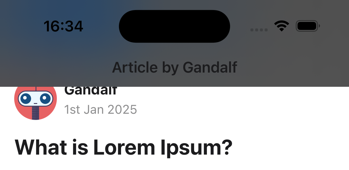
-
systemThickMaterialDark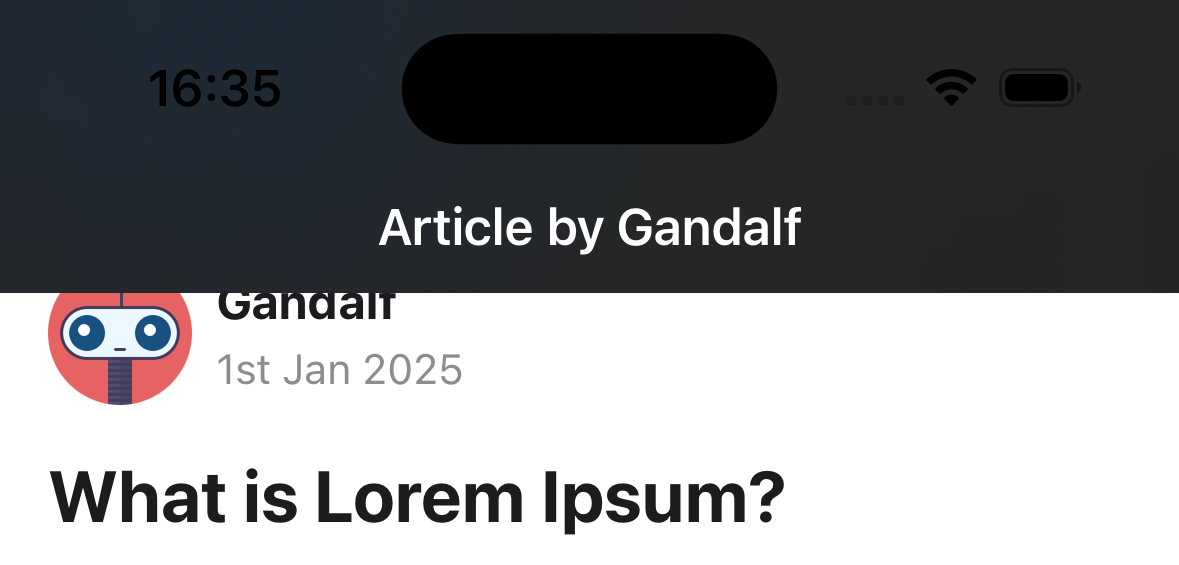
-
systemChromeMaterialDark
Only supported on iOS.
headerBackground
Function which returns a React Element to render as the background of the header. This is useful for using backgrounds such as an image or a gradient.
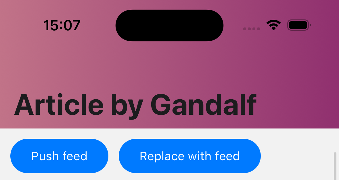
Example:
     headerBackground: () => (
      <LinearGradient
        colors={['#c17388', '#90306f']}
        style={{ flex: 1 }}
        start={{ x: 0, y: 0 }}
        end={{ x: 1, y: 0 }}
      />
      ),
headerTintColor
Tint color for the header. Changes the color of back button and title.
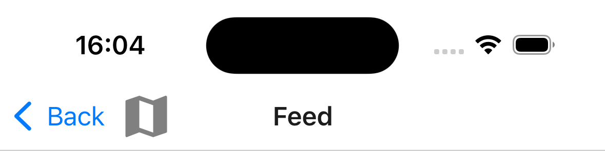
headerLeft
Function which returns a React Element to display on the left side of the header. This replaces the back button. See headerBackVisible to show the back button along side left element.
Example:
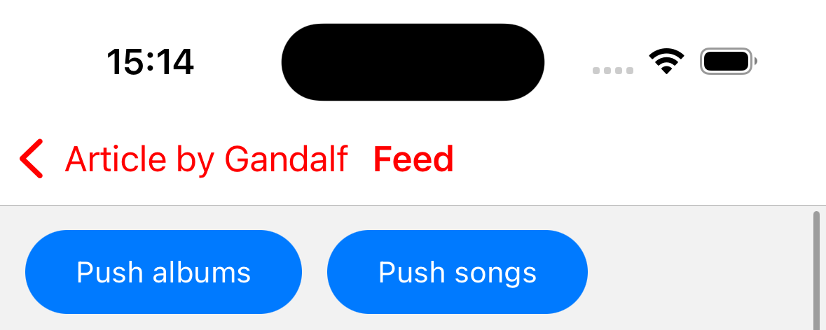
    headerLeft: () => (
      <MaterialCommunityIcons name="map" color="gray" size={36} />
    ),
    headerBackVisible: true,
    headerBackTitle: 'Back',
headerRight
Function which returns a React Element to display on the right side of the header.
Example:
headerRight: () => <MaterialCommunityIcons name="map" color="blue" size={36} />;
headerTitle
String or a function that returns a React Element to be used by the header. Defaults to title or name of the screen.
When a function is passed, it receives tintColor andchildren in the options object as an argument. The title string is passed in children.
Note that if you render a custom element by passing a function, animations for the title won't work.
headerTitleAlign
How to align the header title. Possible values:
-
left
-
center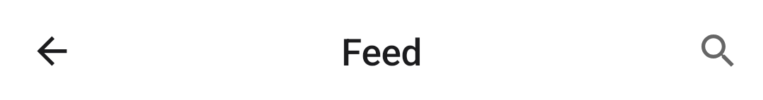
Defaults to left on platforms other than iOS.
Not supported on iOS. It's always center on iOS and cannot be changed.
headerTitleStyle
Style object for header title. Supported properties:
-
fontFamily -
fontSize -
fontWeight -
color
Example:
    headerTitleStyle: {
      color: 'blue',
      fontSize: 22,
      fontFamily: 'Georgia',
      fontWeight: 300,
    },
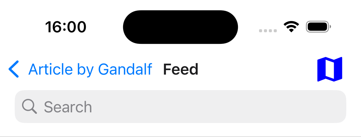
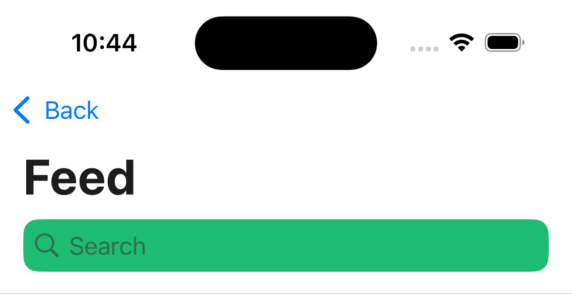
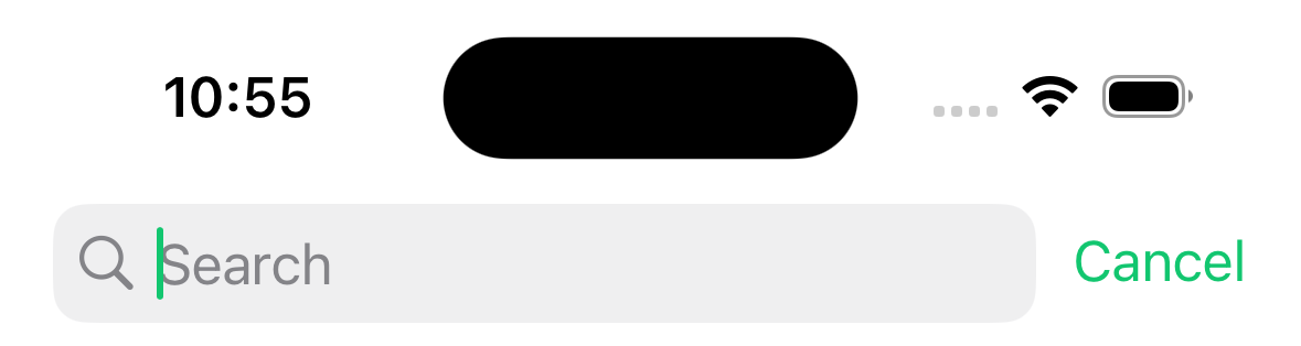
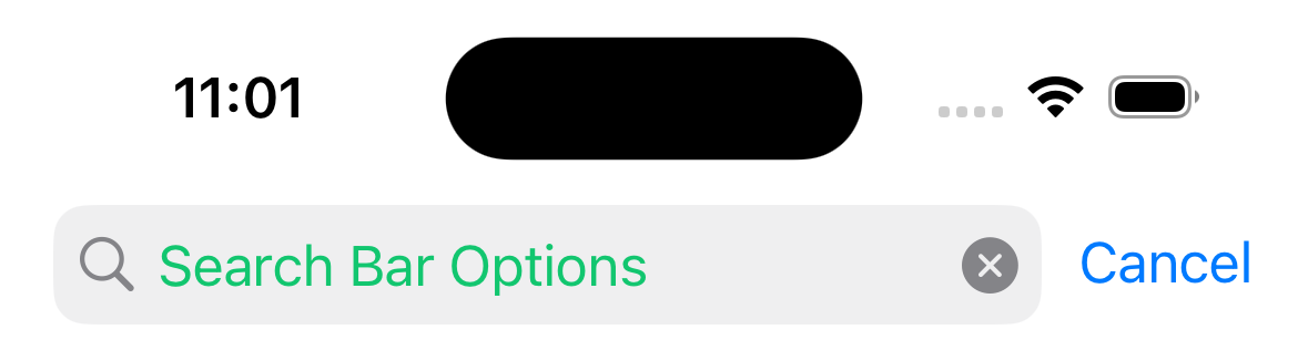
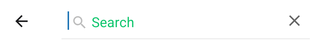
headerSearchBarOptions
Options to render a native search bar on iOS. Search bars are rarely static so normally it is controlled by passing an object to headerSearchBarOptions navigation option in the component's body.
You also need to specify contentInsetAdjustmentBehavior="automatic" in your ScrollView, FlatList etc. If you don't have a ScrollView, specify headerTransparent: false.
Example:
React.useLayoutEffect(() => {
  navigation.setOptions({
    headerSearchBarOptions: {
      // search bar options
    },
  });
}, [navigation]);
Supported properties are:
ref
Ref to manipulate the search input imperatively. It contains the following methods:
focus- focuses the search barblur- removes focus from the search barsetText- sets the search bar's content to given valueclearText- removes any text present in the search bar input fieldcancelSearch- cancel the search and close the search bar
autoCapitalize
Controls whether the text is automatically auto-capitalized as it is entered by the user. Possible values:
nonewordssentencescharacters
Defaults to sentences.
autoFocus
Whether to automatically focus search bar when it's shown. Defaults to false.
Only supported on Android.
barTintColor
The search field background color. By default bar tint color is translucent.
Only supported on iOS.
tintColor
The color for the cursor caret and cancel button text.
Only supported on iOS.
cancelButtonText
The text to be used instead of default Cancel button text.
Only supported on iOS.
disableBackButtonOverride
Whether the back button should close search bar's text input or not. Defaults to false.
Only supported on Android.
hideNavigationBar
Boolean indicating whether to hide the navigation bar during searching. Defaults to true.
Only supported on iOS.
hideWhenScrolling
Boolean indicating whether to hide the search bar when scrolling. Defaults to true.
Only supported on iOS.
inputType
The type of the input. Defaults to "text".
Supported values:
"text""phone""number""email"
Only supported on Android.
obscureBackground
Boolean indicating whether to obscure the underlying content with semi-transparent overlay. Defaults to true.
placeholder
Text displayed when search field is empty.
textColor
The color of the text in the search field.
hintTextColor
The color of the hint text in the search field.
Only supported on Android.
headerIconColor
The color of the search and close icons shown in the header
Only supported on Android.
shouldShowHintSearchIcon
Whether to show the search hint icon when search bar is focused. Defaults to true.
Only supported on Android.
onBlur
A callback that gets called when search bar has lost focus.
onCancelButtonPress
A callback that gets called when the cancel button is pressed.
onChangeText
A callback that gets called when the text changes. It receives the current text value of the search bar.
Example:
const [search, setSearch] = React.useState('');

React.useLayoutEffect(() => {
  navigation.setOptions({
    headerSearchBarOptions: {
      onChangeText: (event) => setSearch(event.nativeEvent.text),
    },
  });
}, [navigation]);
header
Custom header to use instead of the default header.
This accepts a function that returns a React Element to display as a header. The function receives an object containing the following properties as the argument:
navigation- The navigation object for the current screen.route- The route object for the current screen.options- The options for the current screenback- Options for the back button, contains an object with atitleproperty to use for back button label.
Example:
import { getHeaderTitle } from '@react-navigation/elements';

// ..

header: ({ navigation, route, options, back }) => {
  const title = getHeaderTitle(options, route.name);

  return (
    <MyHeader
      title={title}
      leftButton={
        back ? <MyBackButton onPress={navigation.goBack} /> : undefined
      }
      style={options.headerStyle}
    />
  );
};
To set a custom header for all the screens in the navigator, you can specify this option in the screenOptions prop of the navigator.
Note that if you specify a custom header, the native functionality such as large title, search bar etc. won't work.
statusBarAnimation
Sets the status bar animation (similar to the StatusBar component). Defaults to fade on iOS and none on Android.
Supported values:
"fade""none""slide"
On Android, setting either fade or slide will set the transition of status bar color. On iOS, this option applies to appereance animation of the status bar.
Requires setting View controller-based status bar appearance -> YES (or removing the config) in your Info.plist file.
Only supported on Android and iOS.
statusBarHidden
Whether the status bar should be hidden on this screen.
Requires setting View controller-based status bar appearance -> YES (or removing the config) in your Info.plist file.
Only supported on Android and iOS.
statusBarStyle
Sets the status bar color (similar to the StatusBar component).
Supported values:
"auto"(iOS only)"inverted"(iOS only)"dark""light"
Defaults to auto on iOS and light on Android.
Requires setting View controller-based status bar appearance -> YES (or removing the config) in your Info.plist file.
Only supported on Android and iOS.
statusBarBackgroundColor
This option is deprecated and will be removed in a future release (for apps targeting Android SDK 35 or above edge-to-edge mode is enabled by default and it is expected that the edge-to-edge will be enforced in future SDKs, see here for more information).
Sets the background color of the status bar (similar to the StatusBar component).
Only supported on Android.
statusBarTranslucent
This option is deprecated and will be removed in a future release (for apps targeting Android SDK 35 or above edge-to-edge mode is enabled by default and it is expected that the edge-to-edge will be enforced in future SDKs, see here for more information).
Sets the translucency of the status bar (similar to the StatusBar component). Defaults to false.
Only supported on Android.
contentStyle
Style object for the scene content.
animationMatchesGesture
Whether the gesture to dismiss should use animation provided to animation prop. Defaults to false.
Doesn't affect the behavior of screens presented modally.
Only supported on iOS.
fullScreenGestureEnabled
Whether the gesture to dismiss should work on the whole screen. Using gesture to dismiss with this option results in the same transition animation as simple_push. This behavior can be changed by setting customAnimationOnGesture prop. Achieving the default iOS animation isn't possible due to platform limitations. Defaults to false.
Doesn't affect the behavior of screens presented modally.
Only supported on iOS.
fullScreenGestureShadowEnabled
Whether the full screen dismiss gesture has shadow under view during transition. Defaults to true.
This does not affect the behavior of transitions that don't use gestures enabled by fullScreenGestureEnabled prop.
gestureEnabled
Whether you can use gestures to dismiss this screen. Defaults to true. Only supported on iOS.
animationTypeForReplace
The type of animation to use when this screen replaces another screen. Defaults to push.
Supported values:
-
push: the new screen will perform push animation. -
pop: the new screen will perform pop animation.
animation
How the screen should animate when pushed or popped.
Only supported on Android and iOS.
Supported values:
-
default: use the platform default animation -
fade: fade screen in or out -
fade_from_bottom: fade the new screen from bottom -
flip: flip the screen, requirespresentation: "modal"(iOS only) -
simple_push: default animation, but without shadow and native header transition (iOS only, uses default animation on Android) -
slide_from_bottom: slide in the new screen from bottom -
slide_from_right: slide in the new screen from right (Android only, uses default animation on iOS) -
slide_from_left: slide in the new screen from left (Android only, uses default animation on iOS) -
none: don't animate the screen
presentation
How should the screen be presented.
Only supported on Android and iOS.
Supported values:
-
card: the new screen will be pushed onto a stack, which means the default animation will be slide from the side on iOS, the animation on Android will vary depending on the OS version and theme. -
modal: the new screen will be presented modally. this also allows for a nested stack to be rendered inside the screen. -
transparentModal: the new screen will be presented modally, but in addition, the previous screen will stay so that the content below can still be seen if the screen has translucent background. -
containedModal: will use "UIModalPresentationCurrentContext" modal style on iOS and will fallback to "modal" on Android. -
containedTransparentModal: will use "UIModalPresentationOverCurrentContext" modal style on iOS and will fallback to "transparentModal" on Android. -
fullScreenModal: will use "UIModalPresentationFullScreen" modal style on iOS and will fallback to "modal" on Android. A screen using this presentation style can't be dismissed by gesture. -
formSheet: will use "BottomSheetBehavior" on Android and "UIModalPresentationFormSheet" modal style on iOS.
Using Form Sheet
To use Form Sheet for your screen, add presentation: 'formSheet' to the options.
- Static
- Dynamic
import { createNativeStackNavigator } from '@react-navigation/native-stack';

const MyStack = createNativeStackNavigator({
  screens: {
    Home: {
      screen: HomeScreen,
    },
    Profile: {
      screen: ProfileScreen,
      options: {
        presentation: 'formSheet',
        headerShown: false,
        sheetAllowedDetents: 'fitToContents',
      },
    },
  },
});
import { createNativeStackNavigator } from '@react-navigation/native-stack';

const Stack = createNativeStackNavigator();

function MyStack() {
  return (
    <Stack.Navigator>
      <Stack.Screen name="Home" component={HomeScreen} />
      <Stack.Screen
        name="Profile"
        component={ProfileScreen}
        options={{
          presentation: 'formSheet',
          headerShown: false,
          sheetAllowedDetents: 'fitToContents',
        }}
      />
    </Stack.Navigator>
  );
}
Due to technical issues in platform component integration with react-native, presentation: 'formSheet' has limited support for flex: 1.
On Android, using flex: 1 on a top-level content container passed to a formSheet with showAllowedDetents: 'fitToContents' causes the sheet to not display at all, leaving only the dimmed background visible. This is because it is the sheet, not the parent who is source of the size. Setting fixed values for sheetAllowedDetents, e.g. [0.4, 0.9], works correctly (content is aligned for the highest detent).
On iOS, flex: 1 with showAllowedDetents: 'fitToContents' works properly but setting a fixed value for showAllowedDetents causes the screen to not respect the flex: 1 style - the height of the container does not fill the formSheet fully, but rather inherits intrinsic size of its contents. This tradeoff is currently necessary to prevent "sheet flickering" problem on iOS.
If you don't use flex: 1 but the content's height is less than max screen height, the rest of the sheet might become translucent or use the default theme background color (you can see this happening on the screenshots in the descrption of this PR). To match the sheet to the background of your content, set backgroundColor in the contentStyle prop of the given screen.
On Android, there are also some problems with getting nested ScrollViews to work properly. The solution is to set nestedScrollEnabled on the ScrollView, but this does not work if the content's height is less than the ScrollView's height. Please see this PR for details and suggested workaround.
sheetAllowedDetents
Works only when presentation is set to formSheet.
Describes heights where a sheet can rest.
Supported values:
fitToContents- intents to set the sheet height to the height of its contents.- Array of fractions, e.g.
[0.25, 0.5, 0.75]:- Heights should be described as fraction (a number from
[0, 1]interval) of screen height / maximum detent height. - The array must be sorted in ascending order. This invariant is verified only in developement mode, where violation results in error.
- iOS accepts any number of detents, while Android is limited to three - any surplus values, beside first three are ignored.
- Heights should be described as fraction (a number from
Defaults to [1.0].
Only supported on Android and iOS.
sheetElevation
Works only when presentation is set to formSheet.
Integer value describing elevation of the sheet, impacting shadow on the top edge of the sheet.
Not dynamic - changing it after the component is rendered won't have an effect.
Defaults to 24.
Only supported on Android.
sheetExpandsWhenScrolledToEdge
Works only when presentation is set to formSheet.
Whether the sheet should expand to larger detent when scrolling.
Defaults to true.
Only supported on iOS.
Please note that for this interaction to work, the ScrollView must be "first-subview-chain" descendant of the Screen component. This restriction is due to platform requirements.
sheetCornerRadius
Works only when presentation is set to formSheet.
The corner radius that the sheet will try to render with.
If set to non-negative value it will try to render sheet with provided radius, else it will apply system default.
If left unset, system default is used.
Only supported on Android and iOS.
sheetInitialDetentIndex
Works only when presentation is set to formSheet.
Index of the detent the sheet should expand to after being opened.
If the specified index is out of bounds of sheetAllowedDetents array, in dev environment more errors will be thrown, in production the value will be reset to default value.
Additionaly there is last value available, when set the sheet will expand initially to last (largest) detent.
Defaults to 0 - which represents first detent in the detents array.
Only supported on Android and iOS.
sheetGrabberVisible
Works only when presentation is set to formSheet.
Boolean indicating whether the sheet shows a grabber at the top.
Defaults to false.
Only supported on iOS.
sheetLargestUndimmedDetentIndex
Works only when presentation is set to formSheet.
The largest sheet detent for which a view underneath won't be dimmed.
This prop can be set to an number, which indicates index of detent in sheetAllowedDetents array for which there won't be a dimming view beneath the sheet.
Additionaly there are following options available:
none- there will be dimming view for all detents levels,last- there won't be a dimming view for any detent level.
Defaults to none, indicating that the dimming view should be always present.
Only supported on Android and iOS.
orientation
The display orientation to use for the screen.
Supported values:
default- resolves to "all" without "portrait_down" on iOS. On Android, this lets the system decide the best orientation.all: all orientations are permitted.portrait: portrait orientations are permitted.portrait_up: right-side portrait orientation is permitted.portrait_down: upside-down portrait orientation is permitted.landscape: landscape orientations are permitted.landscape_left: landscape-left orientation is permitted.landscape_right: landscape-right orientation is permitted.
Only supported on Android and iOS.
autoHideHomeIndicator
Boolean indicating whether the home indicator should prefer to stay hidden. Defaults to false.
Only supported on iOS.
gestureDirection
Sets the direction in which you should swipe to dismiss the screen.
Supported values:
vertical– dismiss screen verticallyhorizontal– dismiss screen horizontally (default)
When using vertical option, options fullScreenGestureEnabled: true, customAnimationOnGesture: true and animation: 'slide_from_bottom' are set by default.
Only supported on iOS.
animationDuration
Changes the duration (in milliseconds) of slide_from_bottom, fade_from_bottom, fade and simple_push transitions on iOS. Defaults to 350.
The duration of default and flip transitions isn't customizable.
Only supported on iOS.
navigationBarColor
This option is deprecated and will be removed in a future release (for apps targeting Android SDK 35 or above edge-to-edge mode is enabled by default and it is expected that the edge-to-edge will be enforced in future SDKs, see here for more information).
Sets the navigation bar color. Defaults to initial status bar color.
Only supported on Android.
navigationBarHidden
Boolean indicating whether the navigation bar should be hidden. Defaults to false.
Only supported on Android.
freezeOnBlur
Boolean indicating whether to prevent inactive screens from re-rendering. Defaults to false.
Defaults to true when enableFreeze() from react-native-screens package is run at the top of the application.
Only supported on iOS and Android.
Events
The navigator can emit events on certain actions. Supported events are:
transitionStart
This event is fired when the transition animation starts for the current screen.
Event data:
e.data.closing- Boolean indicating whether the screen is being opened or closed.
Example:
React.useEffect(() => {
  const unsubscribe = navigation.addListener('transitionStart', (e) => {
    // Do something
  });

  return unsubscribe;
}, [navigation]);
transitionEnd
This event is fired when the transition animation ends for the current screen.
Event data:
e.data.closing- Boolean indicating whether the screen was opened or closed.
Example:
React.useEffect(() => {
  const unsubscribe = navigation.addListener('transitionEnd', (e) => {
    // Do something
  });

  return unsubscribe;
}, [navigation]);
Helpers
The native stack navigator adds the following methods to the navigation object:
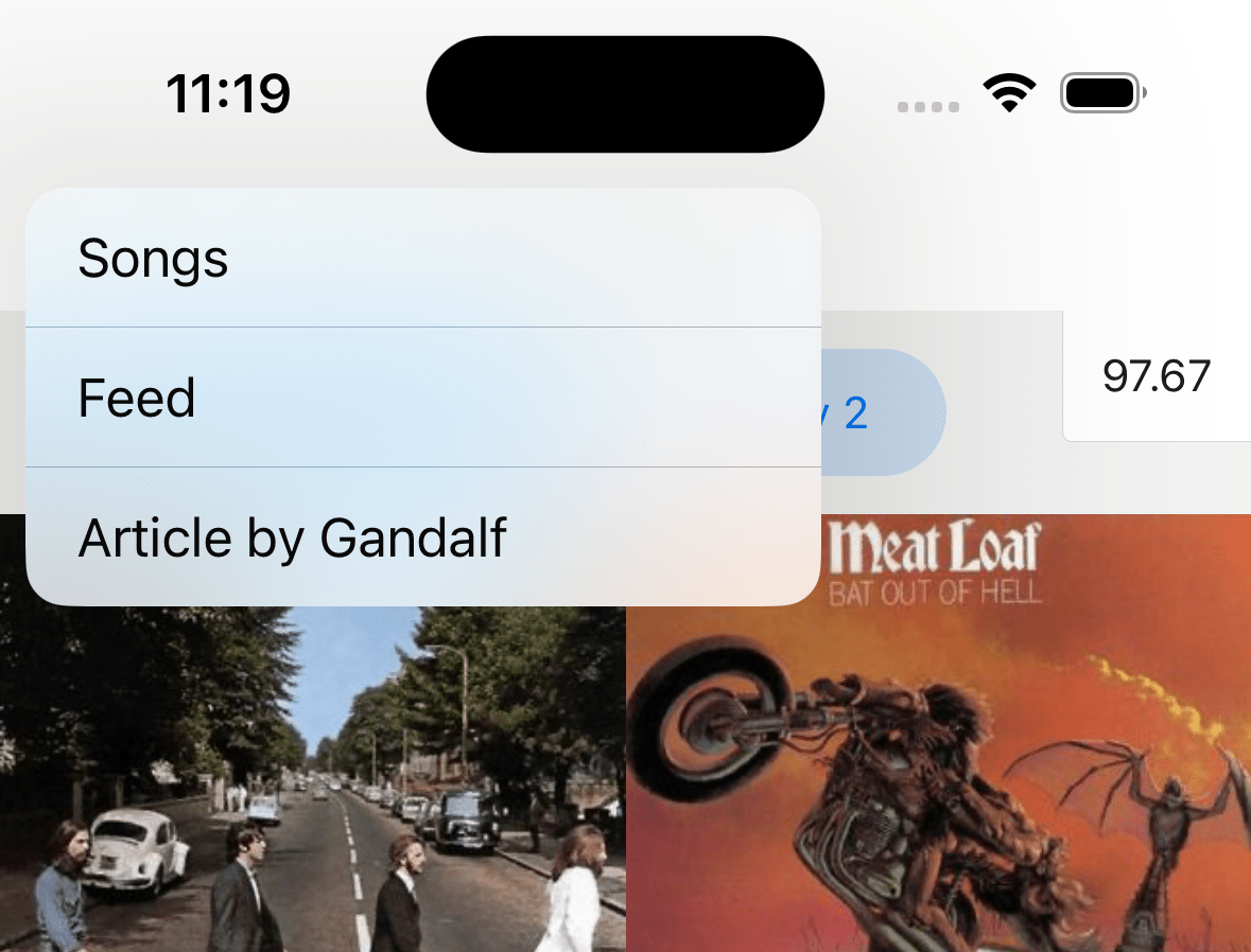
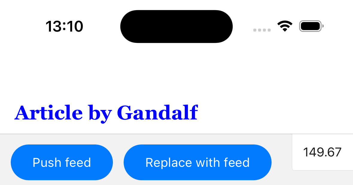
replace
Replaces the current screen with a new screen in the stack. The method accepts the following arguments:
name- string - Name of the route to push onto the stack.params- object - Screen params to pass to the destination route.
navigation.replace('Profile', { owner: 'Michaś' });
push
Pushes a new screen to the top of the stack and navigate to it. The method accepts the following arguments:
name- string - Name of the route to push onto the stack.params- object - Screen params to pass to the destination route.
navigation.push('Profile', { owner: 'Michaś' });
pop
Pops the current screen from the stack and navigates back to the previous screen. It takes one optional argument (count), which allows you to specify how many screens to pop back by.
navigation.pop();
popTo
Navigates back to a previous screen in the stack by popping screens after it. The method accepts the following arguments:
name- string - Name of the route to navigate to.params- object - Screen params to pass to the destination route.options- Options object containing the following properties:merge- boolean - Whether params should be merged with the existing route params, or replace them (when navigating to an existing screen). Defaults tofalse.
If a matching screen is not found in the stack, this will pop the current screen and add a new screen with the specified name and params.
navigation.popTo('Profile', { owner: 'Michaś' });
popToTop
Pops all of the screens in the stack except the first one and navigates to it.
navigation.popToTop();
Hooks
The native stack navigator exports the following hooks:
useAnimatedHeaderHeight
The hook returns an animated value representing the height of the header. This is similar to useHeaderHeight but returns an animated value that changed as the header height changes, e.g. when expanding or collapsing large title or search bar on iOS.
It can be used to animated content along with header height changes.
import { Animated } from 'react-native';
import { useAnimatedHeaderHeight } from '@react-navigation/native-stack';

const MyView = () => {
  const headerHeight = useAnimatedHeaderHeight();

  return (
    <Animated.View
      style={{
        height: 100,
        aspectRatio: 1,
        backgroundColor: 'tomato',
        transform: [{ translateY: headerHeight }],
      }}
    />
  );
};