Supporting safe areas
By default, React Navigation tries to ensure that the elements of the navigators display correctly on devices with notches (e.g. iPhone X) and UI elements which may overlap the app content. Such items include:
- Physical notches
- Status bar overlay
- Home activity indicator on iOS
- Navigation bar on Android
The area not overlapped by such items is referred to as "safe area".
We try to apply proper insets on the UI elements of the navigators to avoid being overlapped by such items. The goal is to (a) maximize usage of the screen (b) without hiding content or making it difficult to interact with by having it obscured by a physical display cutout or some operating system UI.
While React Navigation handles safe areas for the built-in UI elements by default, your own content also needs to handle it to ensure that content isn't hidden by these items.
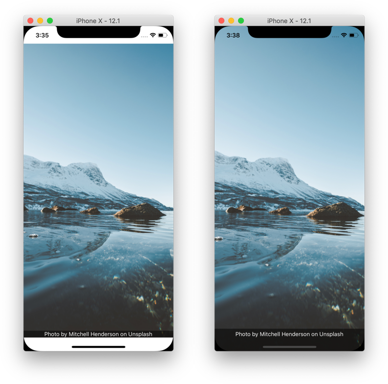
It's tempting to solve (a) by wrapping your entire app in a container with padding that ensures all content will not be occluded. But in doing so, we waste a bunch of space on the screen, as pictured in the image on the left below. What we ideally want is the image pictured on the right.
While React Native exports a SafeAreaView component, it has some inherent issues, i.e. if a screen containing safe area is animating, it causes jumpy behavior. In addition, this component only supports iOS 10+ with no support for older iOS versions or Android. We recommend to use the react-native-safe-area-context library to handle safe areas in a more reliable way.
The rest of this guide gives more information on how to support safe areas in React Navigation.
Hidden/Custom Navigation Bar or Tab Bar
React Navigation handles safe area in the default header. However, if you're using a custom header, it's important to ensure your UI is within the safe area.
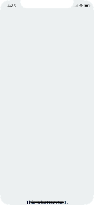
For example, if I render nothing for the header or tabBarComponent, nothing renders
const Tabs = createBottomTabNavigator({
  ...
}, {
  tabBarComponent: () => null,
});

export default createStackNavigator({
  ...
}, {
  headerMode: 'none',
});
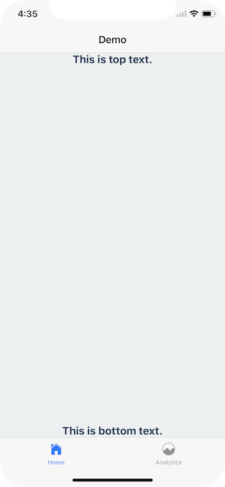
To fix this issue you can apply safe area insets on your content. This can be achieved easily by using the SafeAreaView component from the react-native-safe-area-context library. Recall that SafeAreaView should not wrap entire navigators, just the content inside the screen.
import { SafeAreaView } from 'react-native-safe-area-context';
class MyHomeScreen extends Component {
render() {
return (
<SafeAreaView style={styles.container}>
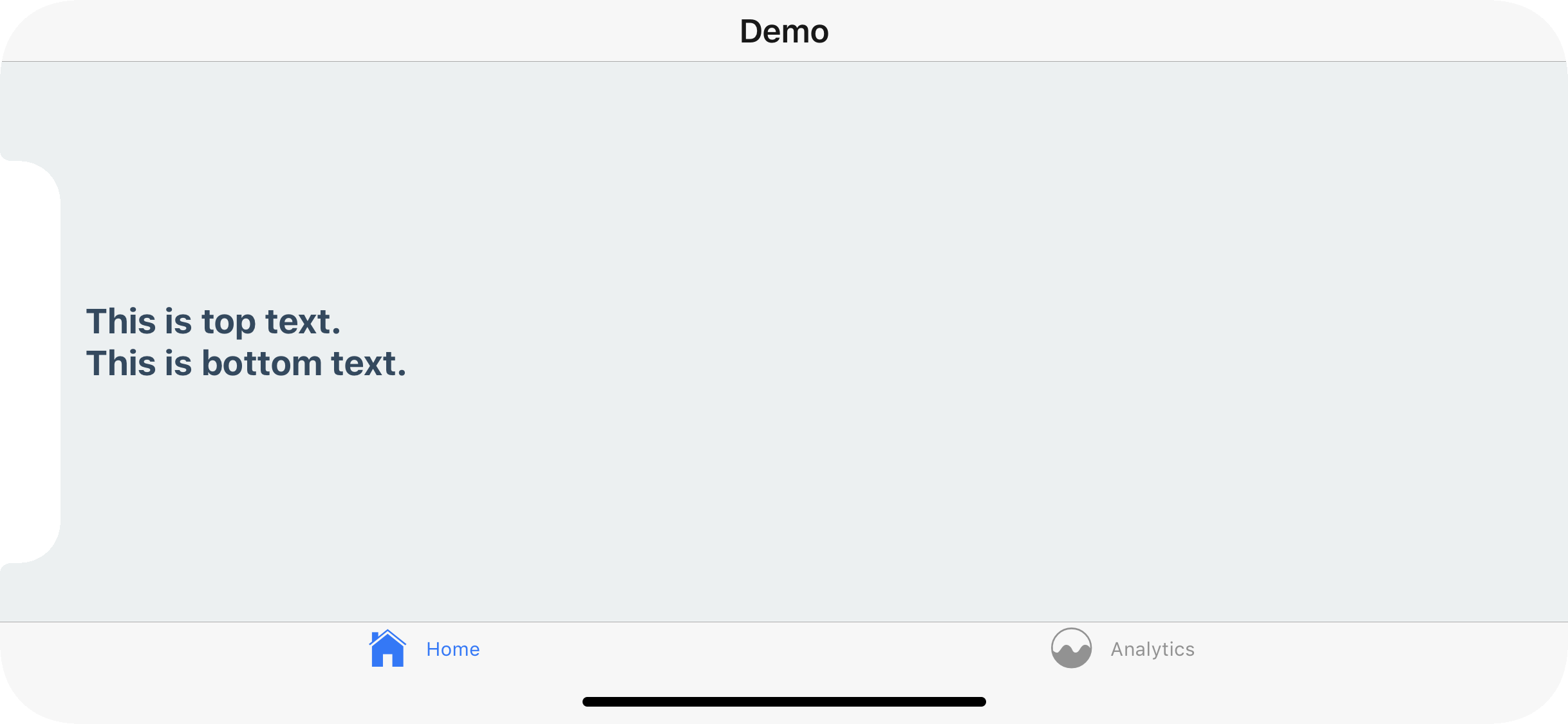
<Text style={styles.paragraph}>This is top text.</Text>
<Text style={styles.paragraph}>This is bottom text.</Text>
</SafeAreaView>
);
}
}
Make sure to wrap your app in SafeAreaProvider as per the instructions here.
This will detect if the app is running on an iPhoneX and, if so, ensure the content isn't hidden behind any hardware elements.
Landscape Mode
Even if you're using the default navigation bar and tab bar if your application works in landscape mode it's important to ensure you content isn't hidden behind the sensor cluster.
To fix this you can, once again, wrap your content in a SafeAreaView. This will not conflict with the navigation bar nor the tab bar's default behavior in portrait mode.
In conclusion, use the SafeAreaView component on the screens you register with a React Navigation navigator.
Use the edges prop to customize the safe area
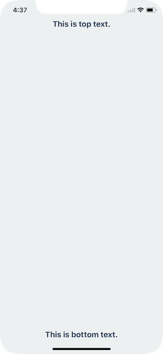
In some cases you might need more control over which paddings are applied. For example, you can remove bottom padding by passing edges prop to SafeAreaView.
<SafeAreaView style={styles.container} edges={['top', 'left', 'right']}>
  <Text style={styles.paragraph}>This is top text.</Text>
  <Text style={styles.paragraph}>This is bottom text.</Text>
</SafeAreaView>
edges takes an array with the values top, bottom, left and right which controls which sides the safe area are applied to.
Use the hook for more control
In some cases you might need more control over which paddings are applied. For example, you can only apply the top and the bottom padding by changing the style object:
import { useSafeAreaInsets } from 'react-native-safe-area-context';
function Demo() {
const insets = useSafeAreaInsets();
return (
<View
style={{
paddingTop: insets.top,
paddingBottom: insets.bottom,
flex: 1,
justifyContent: 'space-between',
alignItems: 'center',
}}
>
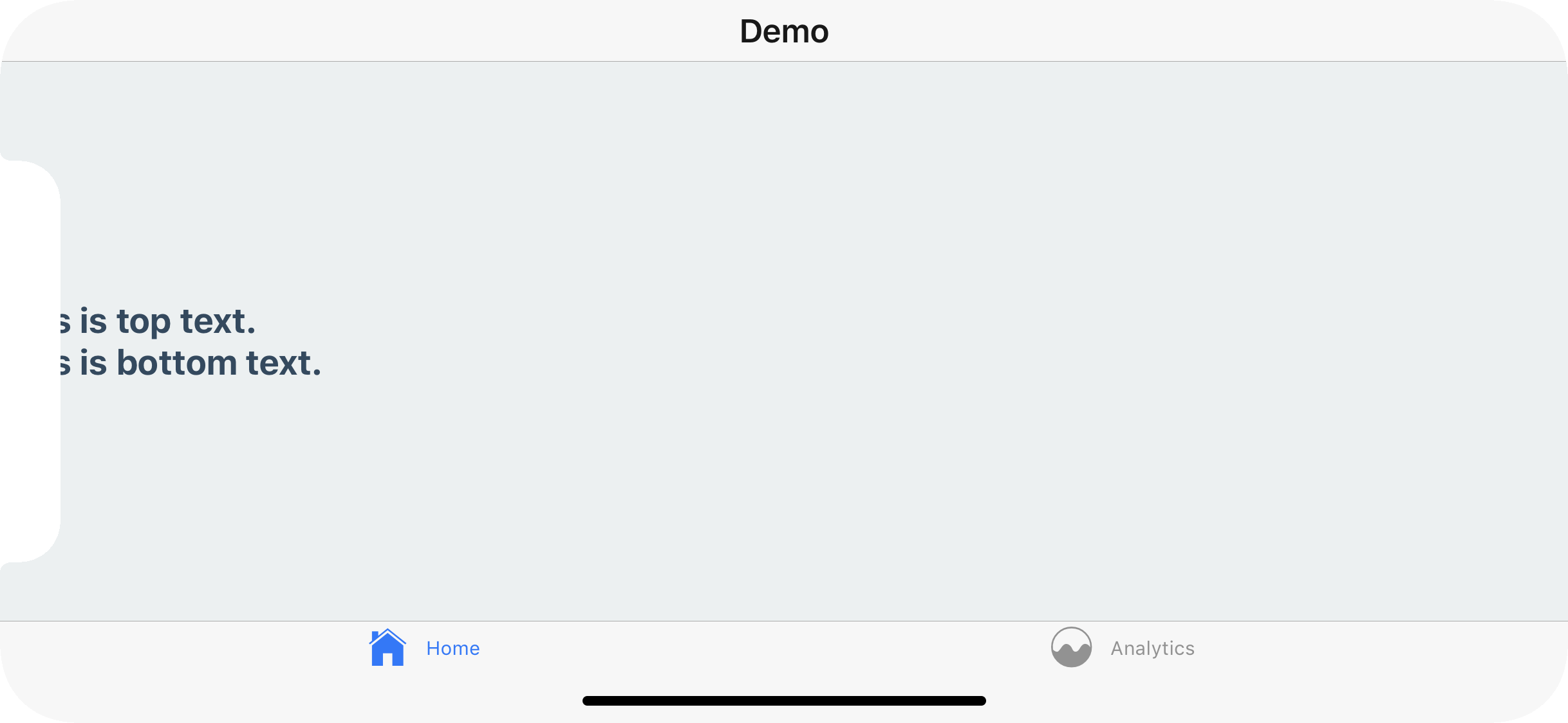
<Text>This is top text.</Text>
<Text>This is bottom text.</Text>
</View>
);
}
Similarly, you could apply these paddings in contentContainerStyle of FlatList to have the content avoid the safe areas, but still show them under the statusbar and navigation bar when scrolling.
Summary
- Use
react-native-safe-area-contextinstead ofSafeAreaViewfromreact-native - Don't wrap your whole app in
SafeAreaView, instead wrap content inside your screens - Use the
edgesprop to apply safe area to specific sides - Use the
useSafeAreaInsetshook for more control over where the insets are applied