Bottom Tabs Navigator
Bottom Tab Navigator displays a set of screens with a tab bar to switch between them.
Installation
To use this navigator, ensure that you have @react-navigation/native and its dependencies (follow this guide), then install @react-navigation/bottom-tabs:
 npm
npm yarn
yarn pnpm
pnpm bun
bun
npm install @react-navigation/bottom-tabs@next
yarn add @react-navigation/bottom-tabs@next
pnpm add @react-navigation/bottom-tabs@next
bun add @react-navigation/bottom-tabs@next
Usage
To use this navigator, import it from @react-navigation/bottom-tabs:
- Static
- Dynamic
import { createBottomTabNavigator } from '@react-navigation/bottom-tabs';

const MyTabs = createBottomTabNavigator({
  screens: {
    Home: HomeScreen,
    Profile: ProfileScreen,
  },
});
import { createBottomTabNavigator } from '@react-navigation/bottom-tabs';

const Tab = createBottomTabNavigator();

function MyTabs() {
  return (
    <Tab.Navigator>
      <Tab.Screen name="Home" component={HomeScreen} />
      <Tab.Screen name="Profile" component={ProfileScreen} />
    </Tab.Navigator>
  );
}
Highlights
Native vs Custom implementation
The navigator provides 2 implementations that can be specified using the implementation prop, native and custom. Many customization options are exclusive to one of the implementations. Make sure to check the documentation of each option to see which implementation it supports.
A custom tabBar can be provided with either implementation. However, you'll need to handle most of the options in your custom tab bar.
native
Uses native primitives for rendering content - UITabBarController on iOS and BottomNavigationView on Android. This allows matching the native design such as liquid glass effect on iOS 26, native tab switch animations etc.
This is the default implementation on Android and iOS, and does not support other platforms.
custom
Uses a JavaScript-based implementation for rendering content.
This is the default implementation on other platforms such as web, macOS and Windows, and supports all platforms.
Notes
- Liquid Glass effect on iOS 26+ requires your app to be built with Xcode 26 or above.
- On Android, at most 5 tabs are supported with the
nativeimplementation. This is a limitation of the underlying native component. - The experimental
SafeAreaViewcomponent fromreact-native-screens/experimentalcan be used to avoid overlapping native tab bar.
API Definition
Props
In addition to the common props shared by all navigators, the bottom tab navigator accepts the following additional props:
implementation
The implementation to use for rendering the tab bar. Possible values:
native- Uses native primitives for rendering contentcustom- Uses a JavaScript-based implementation for rendering content
See Native vs Custom implementation for more details.
- Static
- Dynamic
createBottomTabNavigator({
  implementation: 'custom',
  // ...
});
<Tab.Navigator implementation="custom">{/* ... */}</Tab.Navigator>
backBehavior
This controls what happens when goBack is called in the navigator. This includes pressing the device's back button or back gesture on Android.
It supports the following values:
firstRoute- return to the first screen defined in the navigator (default)initialRoute- return to initial screen passed ininitialRouteNameprop, if not passed, defaults to the first screenorder- return to screen defined before the focused screenhistory- return to last visited screen in the navigator; if the same screen is visited multiple times, the older entries are dropped from the historyfullHistory- return to last visited screen in the navigator; doesn't drop duplicate entries unlikehistory- this behavior is useful to match how web pages worknone- do not handle back button
tabBar
Function that returns a React element to display as the tab bar.
The function receives an object containing the following properties as the argument:
state- The state object for the tab navigator.descriptors- The descriptors object containing options for the tab navigator.navigation- The navigation object for the tab navigator.
The state.routes array contains all the routes defined in the navigator. Each route's options can be accessed using descriptors[route.key].options.
Example:
- Static
- Dynamic
import { View, Platform } from 'react-native';
import { useLinkBuilder, useTheme } from '@react-navigation/native';
import { Text, PlatformPressable } from '@react-navigation/elements';
import { createBottomTabNavigator } from '@react-navigation/bottom-tabs';

function MyTabBar({ state, descriptors, navigation }) {
  const { colors } = useTheme();
  const { buildHref } = useLinkBuilder();

  return (
    <View style={{ flexDirection: 'row' }}>
      {state.routes.map((route, index) => {
        const { options } = descriptors[route.key];
        const label =
          options.tabBarLabel !== undefined
            ? options.tabBarLabel
            : options.title !== undefined
              ? options.title
              : route.name;

        const isFocused = state.index === index;

        const onPress = () => {
          const event = navigation.emit({
            type: 'tabPress',
            target: route.key,
            canPreventDefault: true,
          });

          if (!isFocused && !event.defaultPrevented) {
            navigation.navigate(route.name, route.params);
          }
        };

        const onLongPress = () => {
          navigation.emit({
            type: 'tabLongPress',
            target: route.key,
          });
        };

        return (
          <PlatformPressable
            key={route.key}
            href={buildHref(route.name, route.params)}
            accessibilityState={isFocused ? { selected: true } : {}}
            accessibilityLabel={options.tabBarAccessibilityLabel}
            testID={options.tabBarButtonTestID}
            onPress={onPress}
            onLongPress={onLongPress}
            style={{ flex: 1 }}
          >
            <Text style={{ color: isFocused ? colors.primary : colors.text }}>
              {label}
            </Text>
          </PlatformPressable>
        );
      })}
    </View>
  );
}

const MyTabs = createBottomTabNavigator({
  tabBar: (props) => <MyTabBar {...props} />,
  screens: {
    Home: HomeScreen,
    Profile: ProfileScreen,
  },
});
import { View, Platform } from 'react-native';
import { useLinkBuilder, useTheme } from '@react-navigation/native';
import { Text, PlatformPressable } from '@react-navigation/elements';
import { createBottomTabNavigator } from '@react-navigation/bottom-tabs';

function MyTabBar({ state, descriptors, navigation }) {
  const { colors } = useTheme();
  const { buildHref } = useLinkBuilder();

  return (
    <View style={{ flexDirection: 'row' }}>
      {state.routes.map((route, index) => {
        const { options } = descriptors[route.key];
        const label =
          options.tabBarLabel !== undefined
            ? options.tabBarLabel
            : options.title !== undefined
              ? options.title
              : route.name;

        const isFocused = state.index === index;

        const onPress = () => {
          const event = navigation.emit({
            type: 'tabPress',
            target: route.key,
            canPreventDefault: true,
          });

          if (!isFocused && !event.defaultPrevented) {
            navigation.navigate(route.name, route.params);
          }
        };

        const onLongPress = () => {
          navigation.emit({
            type: 'tabLongPress',
            target: route.key,
          });
        };

        return (
          <PlatformPressable
            key={route.key}
            href={buildHref(route.name, route.params)}
            accessibilityState={isFocused ? { selected: true } : {}}
            accessibilityLabel={options.tabBarAccessibilityLabel}
            testID={options.tabBarButtonTestID}
            onPress={onPress}
            onLongPress={onLongPress}
            style={{ flex: 1 }}
          >
            <Text style={{ color: isFocused ? colors.primary : colors.text }}>
              {label}
            </Text>
          </PlatformPressable>
        );
      })}
    </View>
  );
}

const Tab = createBottomTabNavigator();

function MyTabs() {
  return (
    <Tab.Navigator tabBar={(props) => <MyTabBar {...props} />}>
      <Tab.Screen name="Home" component={HomeScreen} />
      <Tab.Screen name="Profile" component={ProfileScreen} />
    </Tab.Navigator>
  );
}
This example will render a basic tab bar with labels.
Note that you cannot use the useNavigation hook inside the tabBar since useNavigation is only available inside screens. You get a navigation prop for your tabBar which you can use instead:
function MyTabBar({ navigation }) {
  return (
    <Button
      onPress={() => {
        // Navigate using the `navigation` prop that you received
        navigation.navigate('SomeScreen');
      }}
    >
      Go somewhere
    </Button>
  );
}
Options
The following options can be used to configure the screens in the navigator. These can be specified under screenOptions prop of Tab.Navigator or options prop of Tab.Screen.
inactiveBehavior
This controls what should happen when screens become inactive.
It supports the following values:
pause: Effects are cleaned up - e.g. timers are cleared, subscriptions are removed, etc. This avoids unnecessary renders when the screen is inactive.none: Screen renders normally.
Defaults to pause.
If you set lazy: false or preload a screen, it won't be paused until after the first time it becomes focused.
See Inactive screens for more details.
lazy
Whether this screen should render only after the first time it's accessed. Defaults to true. Set it to false if you want to render the screen on the initial render of the navigator.
title
Generic title that can be used as a fallback for headerTitle and tabBarLabel.
tabBarLabel
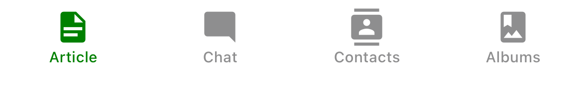
Title string of a tab displayed in the tab bar. When undefined, scene title is used. To hide, see tabBarLabelVisibilityMode.
Overrides the label provided by tabBarSystemItem on iOS.
tabBarSystemItem
Uses iOS built-in tab bar items with standard iOS styling and localized titles. Supported values:
bookmarkscontactsdownloadsfavoritesfeaturedhistorymoremostRecentmostViewedrecentssearchtopRated
Only supported on iOS with native implementation.
The tabBarIcon and tabBarLabel options will override the icon and label from the system item. If you want to keep the system behavior on iOS, but need to provide icon and label for other platforms, use Platform.OS or Platform.select to conditionally set undefined for tabBarIcon and tabBarLabel on iOS.
Search tab on iOS 26+
The tabBarSystemItem option has special styling and behavior when set to search on iOS 26+.
Additionally, when the search tab is selected, the tab bar transforms into a search field if:
- The screen has a nested native stack navigator
- The focused screen in the nested native stack has
headerSearchBarOptions
This won't work if headerSearchBarOptions is set on the tab screen itself.
Example:
- Static
- Dynamic
const SearchStack = createNativeStackNavigator({
  screens: {
    FruitsList: {
      screen: FruitsListScreen,
      options: {
        title: 'Search',
        headerSearchBarOptions: {
          placeholder: 'Search fruits',
        },
      },
    },
  },
});

const HomeTabs = createBottomTabNavigator({
  screens: {
    Home: {
      screen: HomeScreen,
      options: {
        tabBarIcon: Platform.select({
          ios: {
            type: 'sfSymbol',
            name: 'house',
          },
          android: {
            type: 'materialSymbol',
            name: 'home',
          },
        }),
      },
    },
    Search: {
      screen: SearchStack,
      options: {
        tabBarSystemItem: 'search',
      },
    },
  },
});
const Stack = createNativeStackNavigator();

function SearchStack() {
  return (
    <Stack.Navigator>
      <Stack.Screen
        name="FruitsList"
        component={FruitsListScreen}
        options={{
          title: 'Search',
          headerSearchBarOptions: {
            placeholder: 'Search fruits',
          },
        }}
      />
    </Stack.Navigator>
  );
}

const Tab = createBottomTabNavigator();

function HomeTabs() {
  return (
    <Tab.Navigator>
      <Tab.Screen
        name="Home"
        component={HomeScreen}
        options={{
          tabBarIcon: Platform.select({
            ios: {
              type: 'sfSymbol',
              name: 'house',
            },
            android: {
              type: 'materialSymbol',
              name: 'home',
            },
          }),
        }}
      />
      <Tab.Screen
        name="Search"
        component={SearchStack}
        options={{
          tabBarSystemItem: 'search',
        }}
      />
    </Tab.Navigator>
  );
}
tabBarLabelVisibilityMode
The label visibility mode for the tab bar items. Supported values:
auto- decided based on platform and implementation (default)labeled- labels are always shownunlabeled- labels are never shownselected- labels shown only for selected tab (only supported on Android withnativeimplementation)
Supported on all platforms with custom implementation. Only supported on Android with native implementation.
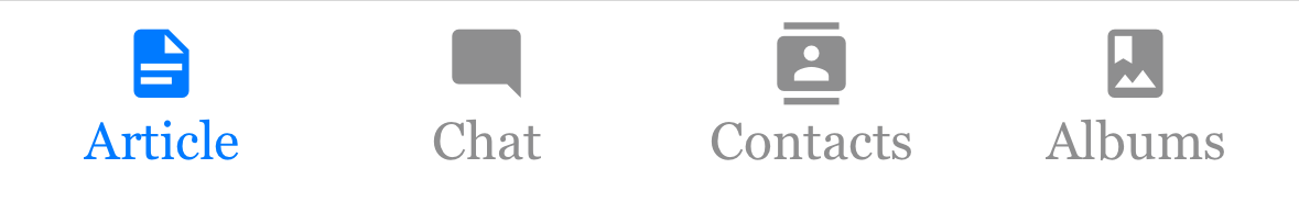
tabBarLabelPosition
Whether the label is shown below the icon or beside the icon.
By default, the position is chosen automatically based on device width.
Only supported with custom implementation.
-
below-icon: the label is shown below the icon (typical for iPhones)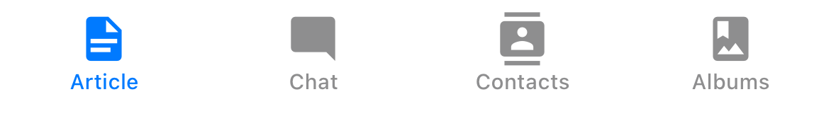
-
beside-iconthe label is shown next to the icon (typical for iPad)
tabBarAllowFontScaling
Whether label font should scale to respect Text Size accessibility settings. Defaults to true.
Only supported with custom implementation.
tabBarLabelStyle
Style object for the tab label. Supported properties:
fontFamilyfontSizefontWeightfontStyle
Example:
tabBarLabelStyle: {
  fontSize: 16,
  fontFamily: 'Georgia',
  fontWeight: 300,
},
tabBarIcon
Icon object to display or a function that given { focused: boolean, color: string, size: number } returns an icon to display in the tab bar. It can be one of the following:
- An icon object with both
nativeandcustomimplementations - A React element with
customimplementation only
It overrides the icon provided by tabBarSystemItem on iOS.
The icon object can be one of the following types:
-
Local image - Supported on all platforms
tabBarIcon: {
  type: 'image',
  source: require('./path/to/icon.png'),
}
It's necessary to provide icons for multiple screen densities (1x, 2x, 3x), e.g.:
icon.png,[email protected],[email protected]etc. as icons are not scaled automatically on iOS for thenativeimplementation.It also supports drawable resource on Android, xcasset on iOS:
tabBarIcon: {
  type: 'image',
  source: { uri: 'icon_name' },
}
A
tintedproperty can be used to control whether the icon should be tinted with the active/inactive color:tabBarIcon: {
type: 'image',
source: require('./path/to/icon.png'),
tinted: false,
}Set
tintedtofalseif the image has its own colors that you want to preserve.The image is tinted by default. Overriding is only supported on iOS for the
nativeimplementation, all platforms for thecustomimplementation. -
SF Symbols name - Supported on iOS
tabBarIcon: {
  type: 'sfSymbol',
  name: 'heart',
}
See Icons for more details.
-
Material Symbols name - Supported on Android
tabBarIcon: {
  type: 'materialSymbol',
  name: 'favorite',
}
It also supports the following optional properties:
variant- Supported values:outlined,rounded,sharpweight- Supported values:100,200,300,400,500,600,700
See Icons for more details.
To render different icons for active and inactive states, you can use a function:
tabBarIcon: ({ focused }) => {
  return {
    type: 'sfSymbol',
    name: focused ? 'heart.fill' : 'heart',
  };
},
This not supported on Android with native implementation, the icon specified for inactive state will be used for both active and inactive states.
To provide different icons for different platforms, you can use Platform.select:
tabBarIcon: Platform.select({
  ios: {
    type: 'sfSymbol',
    name: 'heart',
  },
  android: {
    type: 'materialSymbol',
    name: 'favorite',
  },
  default: {
    type: 'image',
    source: require('./path/to/icon.png'),
  },
});
tabBarIconStyle
Style object for the tab icon.
Only supported with custom implementation.
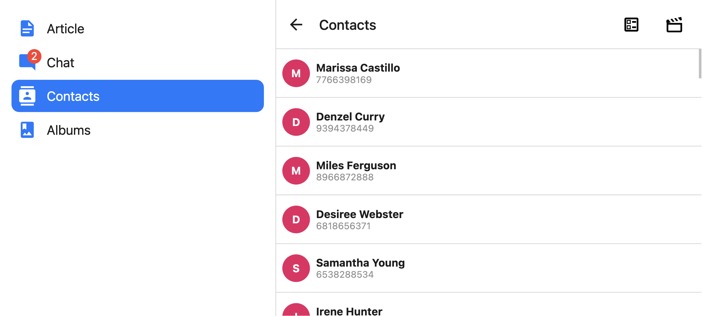
tabBarBadge
Text to show in a badge on the tab icon. Accepts a string or a number.
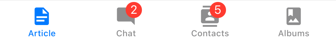
tabBarBadgeStyle
Style for the badge on the tab icon. Supported properties:
backgroundColorcolor
With native implementation, limited customization is supported:
- on iOS, you can only set the background color.
- on Android, you can set both background and text colors.
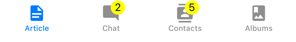
Example:
tabBarBadgeStyle: {
  color: 'black',
  backgroundColor: 'yellow',
},
tabBarAccessibilityLabel
Accessibility label for the tab button. This is read by the screen reader when the user taps the tab. It's recommended to set this if you don't have a label for the tab.
Only supported with custom implementation.
tabBarButton
Function which returns a React element to render as the tab bar button. It wraps the icon and label. Renders PlatformPressable by default.
Only supported with custom implementation.
You can specify a custom implementation here:
tabBarButton: (props) => <TouchableOpacity {...props} />;
tabBarButtonTestID
ID to locate this tab button in tests.
Only supported with custom implementation.
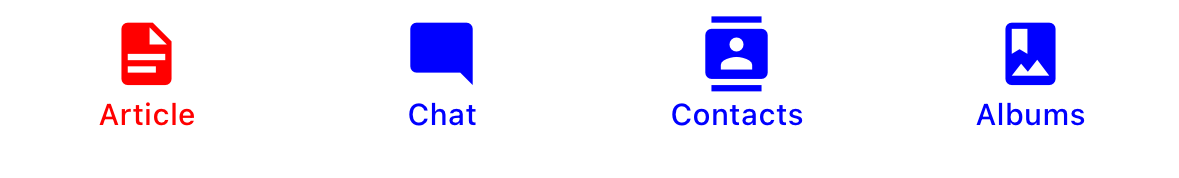
tabBarActiveTintColor
Color for the icon and label in the active tab.
tabBarInactiveTintColor
Color for the icon and label in the inactive tabs.
tabBarActiveIndicatorColor
Background color of the active indicator.
Only supported with native implementation on Android.
tabBarActiveIndicatorEnabled
Whether the active indicator should be used. Defaults to true.
Only supported with native implementation on Android.
tabBarRippleColor
Color of the ripple effect when pressing a tab.
Only supported with native implementation on Android.
tabBarActiveBackgroundColor
Background color for the active tab.
Only supported with custom implementation.
tabBarInactiveBackgroundColor
Background color for the inactive tabs.
Only supported with custom implementation.
tabBarHideOnKeyboard
Whether the tab bar is hidden when the keyboard opens. Defaults to false.
Only supported with custom implementation.
tabBarVisibilityAnimationConfig
Animation config for showing and hiding the tab bar when the keyboard is shown/hidden.
Only supported with custom implementation.
Example:
tabBarVisibilityAnimationConfig: {
  show: {
    animation: 'timing',
    config: {
      duration: 200,
    },
  },
  hide: {
    animation: 'timing',
    config: {
      duration: 100,
    },
  },
},
tabBarItemStyle
Style object for the tab item container.
Only supported with custom implementation.
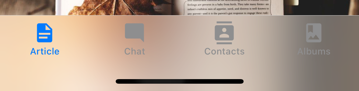
tabBarStyle
Style object for the tab bar. You can configure styles such as background color here.
With custom implementation, this accepts any style properties. With native implementation, only backgroundColor and shadowColor (iOS 18 and below) are supported.
To show your screen under the tab bar, you can set the position style to absolute (only with custom implementation):
<Tab.Navigator
  screenOptions={{
    tabBarStyle: { position: 'absolute' },
  }}
>
You also might need to add a bottom margin to your content if you have an absolutely positioned tab bar. React Navigation won't do it automatically. See useBottomTabBarHeight for more details.
tabBarBackground
Function which returns a React Element to use as background for the tab bar. You could render an image, a gradient, blur view etc.
Only supported with custom implementation.
Example:
import { BlurView } from 'expo-blur';

// ...

<Tab.Navigator
  screenOptions={{
    tabBarStyle: { position: 'absolute' },
    tabBarBackground: () => (
      <BlurView tint="light" intensity={100} style={StyleSheet.absoluteFill} />
    ),
  }}
>
When using BlurView, make sure to set position: 'absolute' in tabBarStyle as well. You'd also need to use useBottomTabBarHeight to add bottom padding to your content.
tabBarPosition
Position of the tab bar. Available values are:
bottom(Default)topleftright
Only supported with custom implementation, or if a custom tabBar is provided with the tabBar prop.
When the tab bar is positioned on the left or right, it is styled as a sidebar. This can be useful when you want to show a sidebar on larger screens and a bottom tab bar on smaller screens:
- Static
- Dynamic
const Tabs = createBottomTabNavigator({
  screenOptions: {
    tabBarPosition: isLargeScreen ? 'left' : 'bottom',
  },

  // ...
});
<Tab.Navigator
  screenOptions={{
    tabBarPosition: isLargeScreen ? 'left' : 'bottom',
  }}
>
You can also render a compact sidebar by placing the label below the icon. This is only supported when the tabBarVariant is set to material:
- Static
- Dynamic
const Tabs = createBottomTabNavigator({
  screenOptions: {
    tabBarPosition: isLargeScreen ? 'left' : 'bottom',
    tabBarVariant: isLargeScreen ? 'material' : 'uikit',
    tabBarLabelPosition: 'below-icon',
  },

  // ...
});
<Tab.Navigator
  screenOptions={{
    tabBarPosition: dimensions.width < 600 ? 'bottom' : 'left',
    tabBarLabelPosition: 'below-icon',
  }}
>
tabBarVariant
Variant of the tab bar. Available values are:
uikit(Default) - The tab bar will be styled according to the iOS UIKit guidelines.material- The tab bar will be styled according to the Material Design guidelines.
Only supported with custom implementation.
The material variant is currently only supported when the tabBarPosition is set to left or right.
tabBarBlurEffect
Blur effect applied to the tab bar on iOS 18 and lower when tab screen is selected.
Supported values:
none- no blur effectsystemDefault- default blur effect applied by the systemextraLightlightdarkregularprominentsystemUltraThinMaterialsystemThinMaterialsystemMaterialsystemThickMaterialsystemChromeMaterialsystemUltraThinMaterialLightsystemThinMaterialLightsystemMaterialLightsystemThickMaterialLightsystemChromeMaterialLightsystemUltraThinMaterialDarksystemThinMaterialDarksystemMaterialDarksystemThickMaterialDarksystemChromeMaterialDark
Defaults to systemDefault.
Only supported with native implementation on iOS 18 and below.
tabBarControllerMode
The display mode for the tab bar. Supported values:
auto- the system sets the display mode based on the tab's contenttabBar- the system displays the content only as a tab bartabSidebar- the tab bar is displayed as a sidebar
Supported on all platforms with custom implementation. By default:
tabBaris positioned at the bottomtabSidebaris positioned on the left (LTR) or right (RTL)
The tabBarPosition option can be used to override this in custom implementation or for custom tabBar.
Supported on iOS 18 and above with native implementation. Not supported on tvOS.
tabBarMinimizeBehavior
The minimize behavior for the tab bar. Supported values:
auto- resolves to the system default minimize behaviornever- the tab bar does not minimizeonScrollDown- the tab bar minimizes when scrolling down and expands when scrolling back uponScrollUp- the tab bar minimizes when scrolling up and expands when scrolling back down
Only supported with native implementation on iOS 26 and above.
bottomAccessory
Function that returns a React element to display as an accessory view. The function receives an options object with a placement parameter that can be one of the following values:
regular- at bottom of the screen, above the tab bar if tab bar is at the bottominline- inline with the collapsed bottom tab bar (e.g., when minimized based ontabBarMinimizeBehavior)
Example:
bottomAccessory: ({ placement }) => {
  return (
    <View style={{ padding: 16 }}>
      <Text>Placement: {placement}</Text>
    </View>
  );
};
Only supported with native implementation on iOS 26 and above.
On Android, iOS 18 and below, nothing is rendered. You can either use the screenLayout or layout props, or render content inside your screen component directly as a fallback.
The content is rendered twice for both placements, but only one is visible at a time based on the tab bar state. Any shared state should be stored outside of the component to keep both versions in sync.
scrollEdgeEffects
Configures the scroll edge effect for the content ScrollView (the ScrollView that is present in first descendants chain of the Screen). Depending on values set, it will blur the scrolling content below certain UI elements (e.g. header items, search bar) for the specified edge of the ScrollView. When set in nested containers, i.e. Native Stack inside Native Bottom Tabs, or the other way around, the ScrollView will use only the innermost one's config.
Edge effects can be configured for each edge separately. The following values are currently supported:
automatic- the automatic scroll edge effect style,hard- a scroll edge effect with a hard cutoff and dividing line,soft- a soft-edged scroll edge effect,hidden- no scroll edge effect.
Defaults to automatic for each edge.
Only supported with native implementation on iOS 26 and above.
popToTopOnBlur
Boolean indicating whether any nested stack should be popped to the top of the stack when navigating away from this tab. Defaults to false.
It only works when there is a stack navigator (e.g. stack navigator or native stack navigator) nested under the tab navigator.
sceneStyle
Style object for the component wrapping the screen content.
Header related options
The navigator does not show a header by default. It renders a native stack header if headerShown is set to true in the screen options explicitly, or if a custom header is provided with the header option.
You can find the list of header related options here. These options can be specified under screenOptions prop of Tab.Navigator or options prop of Tab.Screen. You don't have to be using @react-navigation/elements directly to use these options, they are just documented in that page.
In addition to those, the following options are also supported in bottom tabs:
header
Custom header to use instead of the default header.
This accepts a function that returns a React Element to display as a header. The function receives an object containing the following properties as the argument:
navigation- The navigation object for the current screen.route- The route object for the current screen.options- The options for the current screen
Example:
import { getHeaderTitle } from '@react-navigation/elements';

// ..

header: ({ navigation, route, options }) => {
  const title = getHeaderTitle(options, route.name);

  return <MyHeader title={title} style={options.headerStyle} />;
};
To set a custom header for all the screens in the navigator, you can specify this option in the screenOptions prop of the navigator.
Specify a height in headerStyle
If your custom header's height differs from the default header height, then you might notice glitches due to measurement being async. Explicitly specifying the height will avoid such glitches.
Example:
headerStyle: {
  height: 80, // Specify the height of your custom header
};
Note that this style is not applied to the header by default since you control the styling of your custom header. If you also want to apply this style to your header, use options.headerStyle from the props.
headerShown
Whether to show or hide the header for the screen. The header is not shown by default unless a custom header is provided with the header option.
Events
The navigator can emit events on certain actions. Supported events are:
tabPress
This event is fired when the user presses the tab button for the current screen in the tab bar. By default a tab press does several things:
- If the tab is not focused, tab press will focus that tab
- If the tab is already focused:
- If the screen for the tab renders a scroll view, you can use
useScrollToTopto scroll it to top - If the screen for the tab renders a stack navigator, a
popToTopaction is performed on the stack
- If the screen for the tab renders a scroll view, you can use
To prevent the default behavior, you can call event.preventDefault.
Calling event.preventDefault is only supported with the custom implementation. The default behavior cannot be prevented with the native implementation.
- Static
- Dynamic
React.useEffect(() => {
  const unsubscribe = navigation.addListener('tabPress', (e) => {
    // Prevent default behavior
    e.preventDefault();

    // Do something manually
    // ...
  });

  return unsubscribe;
}, [navigation]);
React.useEffect(() => {
  const unsubscribe = navigation.addListener('tabPress', (e) => {
    // Prevent default behavior
    e.preventDefault();

    // Do something manually
    // ...
  });

  return unsubscribe;
}, [navigation]);
If you have a custom tab bar, make sure to emit this event.
By default, tabs are rendered lazily. So if you add a listener inside a screen component, it won't receive the event until the screen is focused for the first time. If you need to listen to this event before the screen is focused, you can specify the listener in the screen config instead.
tabLongPress
This event is fired when the user presses the tab button for the current screen in the tab bar for an extended period. If you have a custom tab bar, make sure to emit this event.
Only supported with the custom implementation.
Example:
React.useEffect(() => {
  const unsubscribe = navigation.addListener('tabLongPress', (e) => {
    // Do something
  });

  return unsubscribe;
}, [navigation]);
transitionStart
This event is fired when a transition animation starts when switching tabs.
Example:
React.useEffect(() => {
  const unsubscribe = navigation.addListener('transitionStart', (e) => {
    // Do something
  });

  return unsubscribe;
}, [navigation]);
transitionEnd
This event is fired when a transition animation ends when switching tabs.
Example:
React.useEffect(() => {
  const unsubscribe = navigation.addListener('transitionEnd', (e) => {
    // Do something
  });

  return unsubscribe;
}, [navigation]);
Helpers
The tab navigator adds the following methods to the navigation object:
jumpTo
Navigates to an existing screen in the tab navigator. The method accepts following arguments:
name- string - Name of the route to jump to.params- object - Screen params to use for the destination route.
- Static
- Dynamic
navigation.jumpTo('Profile', { owner: 'Michaś' })
navigation.jumpTo('Profile', { owner: 'Michaś' })
Hooks
The bottom tab navigator exports the following hooks:
useBottomTabBarHeight
This hook returns the height of the bottom tab bar. By default, the screen content doesn't go under the tab bar. However, if you want to make the tab bar absolutely positioned and have the content go under it (e.g. to show a blur effect), it's necessary to adjust the content to take the tab bar height into account.
Example:
import { useBottomTabBarHeight } from '@react-navigation/bottom-tabs';

function MyComponent() {
  const tabBarHeight = useBottomTabBarHeight();

  return (
    <ScrollView contentStyle={{ paddingBottom: tabBarHeight }}>
      {/* Content */}
    </ScrollView>
  );
}
Alternatively, you can use the BottomTabBarHeightContext directly if you are using a class component or need it in a reusable component that can be used outside the bottom tab navigator:
import { BottomTabBarHeightContext } from '@react-navigation/bottom-tabs';

// ...

<BottomTabBarHeightContext.Consumer>
  {tabBarHeight => (
    /* render something */
  )}
</BottomTabBarHeightContext.Consumer>
Animations
By default, switching between tabs doesn't have any animation. You can specify the animation option to customize the transition animation.
Customizing animations are only supported with the custom implementation.
Supported values for animation are:
-
fade- Cross-fade animation for the screen transition where the new screen fades in and the old screen fades out. -
shift- Shifting animation for the screen transition where the screens slightly shift to left/right. -
none- The screen transition doesn't have any animation. This is the default value.
- Static
- Dynamic
const RootTabs = createBottomTabNavigator({
  screenOptions: {
    animation: 'fade',
  },
  screens: {
    Home: HomeScreen,
    Profile: ProfileScreen,
  },
});
const Tab = createBottomTabNavigator();

function RootTabs() {
  return (
    <Tab.Navigator
      screenOptions={{
        animation: 'fade',
      }}
    >
      <Tab.Screen name="Home" component={HomeScreen} />
      <Tab.Screen name="Profile" component={ProfileScreen} />
    </Tab.Navigator>
  );
}
If you need more control over the animation, you can customize individual parts of the animation using the various animation-related options:
Animation related options
Bottom Tab Navigator exposes various options to configure the transition animation when switching tabs. These transition animations can be customized on a per-screen basis by specifying the options in the options for each screen, or for all screens in the tab navigator by specifying them in the screenOptions.
-
transitionSpec- An object that specifies the animation type (timingorspring) and its options (such asdurationfortiming). It contains 2 properties:animation- The animation function to use for the animation. Supported values aretimingandspring.config- The configuration object for the timing function. Fortiming, it can bedurationandeasing. Forspring, it can bestiffness,damping,mass,overshootClamping,restDisplacementThresholdandrestSpeedThreshold.
A config that uses a timing animation looks like this:
const config = {
  animation: 'timing',
  config: {
    duration: 150,
    easing: Easing.inOut(Easing.ease),
  },
};
We can pass this config in the
transitionSpecoption:- Static
- Dynamic
{
  Profile: {
    screen: Profile,
    options: {
      transitionSpec: {
        animation: 'timing',
        config: {
          duration: 150,
          easing: Easing.inOut(Easing.ease),
        },
      },
    },
  },
}<Tab.Screen
name="Profile"
component={Profile}
options={{
transitionSpec: {
animation: 'timing',
config: {
duration: 150,
easing: Easing.inOut(Easing.ease),
},
},
}}
/> -
sceneStyleInterpolator- This is a function that specifies interpolated styles for various parts of the scene. It currently supports style for the view containing the screen:sceneStyle- Style for the container view wrapping the screen content.
The function receives the following properties in its argument:
current- Animation values for the current screen:progress- Animated node representing the progress value of the current screen.
A config that fades the screen looks like this:
const forFade = ({ current }) => ({
  sceneStyle: {
    opacity: current.progress.interpolate({
      inputRange: [-1, 0, 1],
      outputRange: [0, 1, 0],
    }),
  },
});
The value of
current.progressis as follows:- -1 if the index is lower than the active tab,
- 0 if they're active,
- 1 if the index is higher than the active tab
We can pass this function in
sceneStyleInterpolatoroption:- Static
- Dynamic
{
  Profile: {
    screen: Profile,
    options: {
      sceneStyleInterpolator: ({ current }) => ({
        sceneStyle: {
          opacity: current.progress.interpolate({
            inputRange: [-1, 0, 1],
            outputRange: [0, 1, 0],
          }),
        },
      }),
    },
  },
}<Tab.Screen
name="Profile"
component={Profile}
options={{
sceneStyleInterpolator: ({ current }) => ({
sceneStyle: {
opacity: current.progress.interpolate({
inputRange: [-1, 0, 1],
outputRange: [0, 1, 0],
}),
},
}),
}}
/>
Putting these together, you can customize the transition animation for a screen:
Putting these together, you can customize the transition animation for a screen:
- Static
- Dynamic
const RootTabs = createBottomTabNavigator({
  screenOptions: {
    transitionSpec: {
      animation: 'timing',
      config: {
        duration: 150,
        easing: Easing.inOut(Easing.ease),
      },
    },
    sceneStyleInterpolator: ({ current }) => ({
      sceneStyle: {
        opacity: current.progress.interpolate({
          inputRange: [-1, 0, 1],
          outputRange: [0, 1, 0],
        }),
      },
    }),
  },
  screens: {
    Home: HomeScreen,
    Profile: ProfileScreen,
  },
});
const Tab = createBottomTabNavigator();

function RootTabs() {
  return (
    <Tab.Navigator
      screenOptions={{
        transitionSpec: {
          animation: 'timing',
          config: {
            duration: 150,
            easing: Easing.inOut(Easing.ease),
          },
        },
        sceneStyleInterpolator: ({ current }) => ({
          sceneStyle: {
            opacity: current.progress.interpolate({
              inputRange: [-1, 0, 1],
              outputRange: [0, 1, 0],
            }),
          },
        }),
      }}
    >
      <Tab.Screen name="Home" component={HomeScreen} />
      <Tab.Screen name="Profile" component={ProfileScreen} />
    </Tab.Navigator>
  );
}
Pre-made configs
We also export various configs from the library with ready-made configs that you can use to customize the animations:
TransitionSpecs
FadeSpec- Configuration for a cross-fade animation between screens.ShiftSpec- Configuration for a shifting animation between screens.
Example:
- Static
- Dynamic
import { TransitionSpecs } from '@react-navigation/bottom-tabs';

// ...

{
  Profile: {
    screen: Profile,
    options: {
      transitionSpec: TransitionSpecs.CrossFadeSpec,
    },
  },
}
import { TransitionSpecs } from '@react-navigation/bottom-tabs';

// ...

<Tab.Screen
  name="Profile"
  component={Profile}
  options={{
    transitionSpec: TransitionSpecs.FadeSpec,
  }}
/>;
SceneStyleInterpolators
forFade- Cross-fade animation for the screen transition where the new screen fades in and the old screen fades out.forShift- Shifting animation for the screen transition where the screens slightly shift to left/right.
Example:
- Static
- Dynamic
import { SceneStyleInterpolators } from '@react-navigation/bottom-tabs';

// ...

{
  Profile: {
    screen: Profile,
    options: {
      sceneStyleInterpolator: SceneStyleInterpolators.forFade,
    },
  },
}
import { SceneStyleInterpolators } from '@react-navigation/bottom-tabs';

// ...

<Tab.Screen
  name="Profile"
  component={Profile}
  options={{
    sceneStyleInterpolator: SceneStyleInterpolators.forFade,
  }}
/>;
TransitionPresets
We export transition presets that bundle various sets of these options together. A transition preset is an object containing a few animation-related screen options exported under TransitionPresets. Currently the following presets are available:
FadeTransition- Cross-fade animation for the screen transition where the new screen fades in and the old screen fades out.ShiftTransition- Shifting animation for the screen transition where the screens slightly shift to left/right.
You can spread these presets in options to customize the animation for a screen:
Example:
- Static
- Dynamic
import { TransitionPresets } from '@react-navigation/bottom-tabs';

// ...

{
  Profile: {
    screen: Profile,
    options: {
      ...TransitionPresets.FadeTransition,
    },
  },
}
import { TransitionPresets } from '@react-navigation/bottom-tabs';

// ...

<Tab.Screen
  name="Profile"
  component={Profile}
  options={{
    ...TransitionPresets.FadeTransition,
  }}
/>;