Drawer Navigator
Drawer Navigator renders a navigation drawer on the side of the screen which can be opened and closed via gestures.
This wraps react-native-drawer-layout. If you want to use the drawer without React Navigation integration, use the library directly instead.
Installation
To use this navigator, ensure that you have @react-navigation/native and its dependencies (follow this guide), then install @react-navigation/drawer:
npm
yarn
pnpm
bun
npm install @react-navigation/drawer
yarn add @react-navigation/drawer
pnpm add @react-navigation/drawer
bun add @react-navigation/drawer
The navigator depends on react-native-gesture-handler for gestures and react-native-reanimated for animations.
- Expo
- Community CLI
If you have a Expo managed project, in your project directory, run:
npx expo install react-native-gesture-handler react-native-reanimated react-native-worklets
If you have a bare React Native project, in your project directory, run:
npm
yarn
pnpm
bun
npm install react-native-gesture-handler react-native-reanimated react-native-worklets
yarn add react-native-gesture-handler react-native-reanimated react-native-worklets
pnpm add react-native-gesture-handler react-native-reanimated react-native-worklets
bun add react-native-gesture-handler react-native-reanimated react-native-worklets
After installation, configure the Reanimated Babel Plugin in your project following the installation guide.
If you're on a Mac and developing for iOS, you also need to install pods to complete the linking.
npx pod-install ios
Usage
To use this navigator, import it from @react-navigation/drawer:
- Static
- Dynamic
import { createDrawerNavigator } from '@react-navigation/drawer';

const MyDrawer = createDrawerNavigator({
  screens: {
    Home: HomeScreen,
    Profile: ProfileScreen,
  },
});
import { createDrawerNavigator } from '@react-navigation/drawer';

const Drawer = createDrawerNavigator();

function MyDrawer() {
  return (
    <Drawer.Navigator>
      <Drawer.Screen name="Home" component={HomeScreen} />
      <Drawer.Screen name="Profile" component={ProfileScreen} />
    </Drawer.Navigator>
  );
}
API Definition
Props
In addition to the common props shared by all navigators, the drawer navigator component accepts the following additional props:
backBehavior
This controls what happens when goBack is called in the navigator. This includes pressing the device's back button or back gesture on Android.
It supports the following values:
firstRoute- return to the first screen defined in the navigator (default)initialRoute- return to initial screen passed ininitialRouteNameprop, if not passed, defaults to the first screenorder- return to screen defined before the focused screenhistory- return to last visited screen in the navigator; if the same screen is visited multiple times, the older entries are dropped from the historyfullHistory- return to last visited screen in the navigator; doesn't drop duplicate entries unlikehistory- this behavior is useful to match how web pages worknone- do not handle back button
defaultStatus
The default status of the drawer - whether the drawer should stay open or closed by default.
When this is set to open, the drawer will be open from the initial render. It can be closed normally using gestures or programmatically. However, when going back, the drawer will re-open if it was closed. This is essentially the opposite of the default behavior of the drawer where it starts closed, and the back button closes an open drawer.
detachInactiveScreens
Boolean used to indicate whether inactive screens should be detached from the view hierarchy to save memory. This enables integration with react-native-screens. Defaults to true.
drawerContent
Function that returns React element to render as the content of the drawer, for example, navigation items
The content component receives the following props by default:
state- The navigation state of the navigator.navigation- The navigation object for the navigator.descriptors- An descriptor object containing options for the drawer screens. The options can be accessed atdescriptors[route.key].options.
Providing a custom drawerContent
The default component for the drawer is scrollable and only contains links for the routes in the RouteConfig. You can easily override the default component to add a header, footer, or other content to the drawer. The default content component is exported as DrawerContent. It renders a DrawerItemList component inside a ScrollView.
By default, the drawer is scrollable and supports devices with notches. If you customize the content, you can use DrawerContentScrollView to handle this automatically:
import {
  DrawerContentScrollView,
  DrawerItemList,
} from '@react-navigation/drawer';

function CustomDrawerContent(props) {
  return (
    <DrawerContentScrollView {...props}>
      <DrawerItemList {...props} />
    </DrawerContentScrollView>
  );
}
To add additional items in the drawer, you can use the DrawerItem component:
- Static
- Dynamic
function CustomDrawerContent(props) {
  return (
    <DrawerContentScrollView {...props}>
      <DrawerItemList {...props} />
      <DrawerItem
        label="Help"
        onPress={() => Linking.openURL('https://mywebsite.com/help')}
      />
    </DrawerContentScrollView>
  );
}
function CustomDrawerContent(props) {
  return (
    <DrawerContentScrollView {...props}>
      <DrawerItemList {...props} />
      <DrawerItem
        label="Help"
        onPress={() => Linking.openURL('https://mywebsite.com/help')}
      />
    </DrawerContentScrollView>
  );
}
The DrawerItem component accepts the following props:
label(required): The label text of the item. Can be string, or a function returning a react element. e.g.({ focused, color }) => <Text style={{ color }}>{focused ? 'Focused text' : 'Unfocused text'}</Text>.icon: Icon to display for the item. Accepts a function returning a react element. e.g.({ focused, color, size }) => <Icon color={color} size={size} name={focused ? 'heart' : 'heart-outline'} />.focused: Boolean indicating whether to highlight the drawer item as active.onPress(required): Function to execute on press.activeTintColor: Color for the icon and label when the item is active.inactiveTintColor: Color for the icon and label when the item is inactive.activeBackgroundColor: Background color for item when it's active.inactiveBackgroundColor: Background color for item when it's inactive.labelStyle: Style object for the labelText.style: Style object for the wrapperView.
Note that you cannot use the useNavigation hook inside the drawerContent since useNavigation is only available inside screens. You get a navigation prop for your drawerContent which you can use instead:
function CustomDrawerContent({ navigation }) {
  return (
    <Button
      onPress={() => {
        // Navigate using the `navigation` prop that you received
        navigation.navigate('SomeScreen');
      }}
    >
      Go somewhere
    </Button>
  );
}
To use the custom component, we need to pass it in the drawerContent prop:
<Drawer.Navigator drawerContent={(props) => <CustomDrawerContent {...props} />}>
  {/* screens */}
</Drawer.Navigator>
Options
The following options can be used to configure the screens in the navigator. These can be specified under screenOptions prop of Drawer.Navigator or options prop of Drawer.Screen.
title
A generic title that can be used as a fallback for headerTitle and drawerLabel.
lazy
Whether this screen should render the first time it's accessed. Defaults to true. Set it to false if you want to render the screen on initial render.
drawerLabel
String or a function that given { focused: boolean, color: string } returns a React.Node, to display in drawer sidebar. When undefined, scene title is used.
drawerIcon
Function, that given { focused: boolean, color: string, size: number } returns a React.Node to display in drawer sidebar.
drawerActiveTintColor
Color for the icon and label in the active item in the drawer.
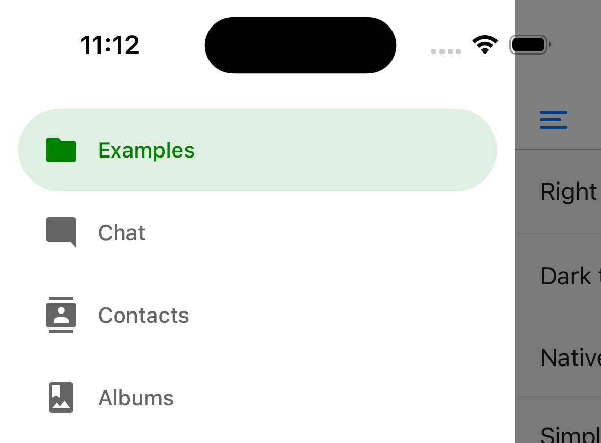
drawerActiveTintColor: 'green',
drawerActiveBackgroundColor
Background color for the active item in the drawer.
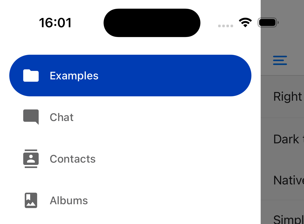
    screenOptions={{
      drawerActiveTintColor: 'white',
      drawerActiveBackgroundColor: '#003CB3',
      drawerLabelStyle: {
        color: 'white',
      },
    }}
drawerInactiveTintColor
Color for the icon and label in the inactive items in the drawer.
drawerInactiveBackgroundColor
Background color for the inactive items in the drawer.
drawerItemStyle
Style object for the single item, which can contain an icon and/or a label.
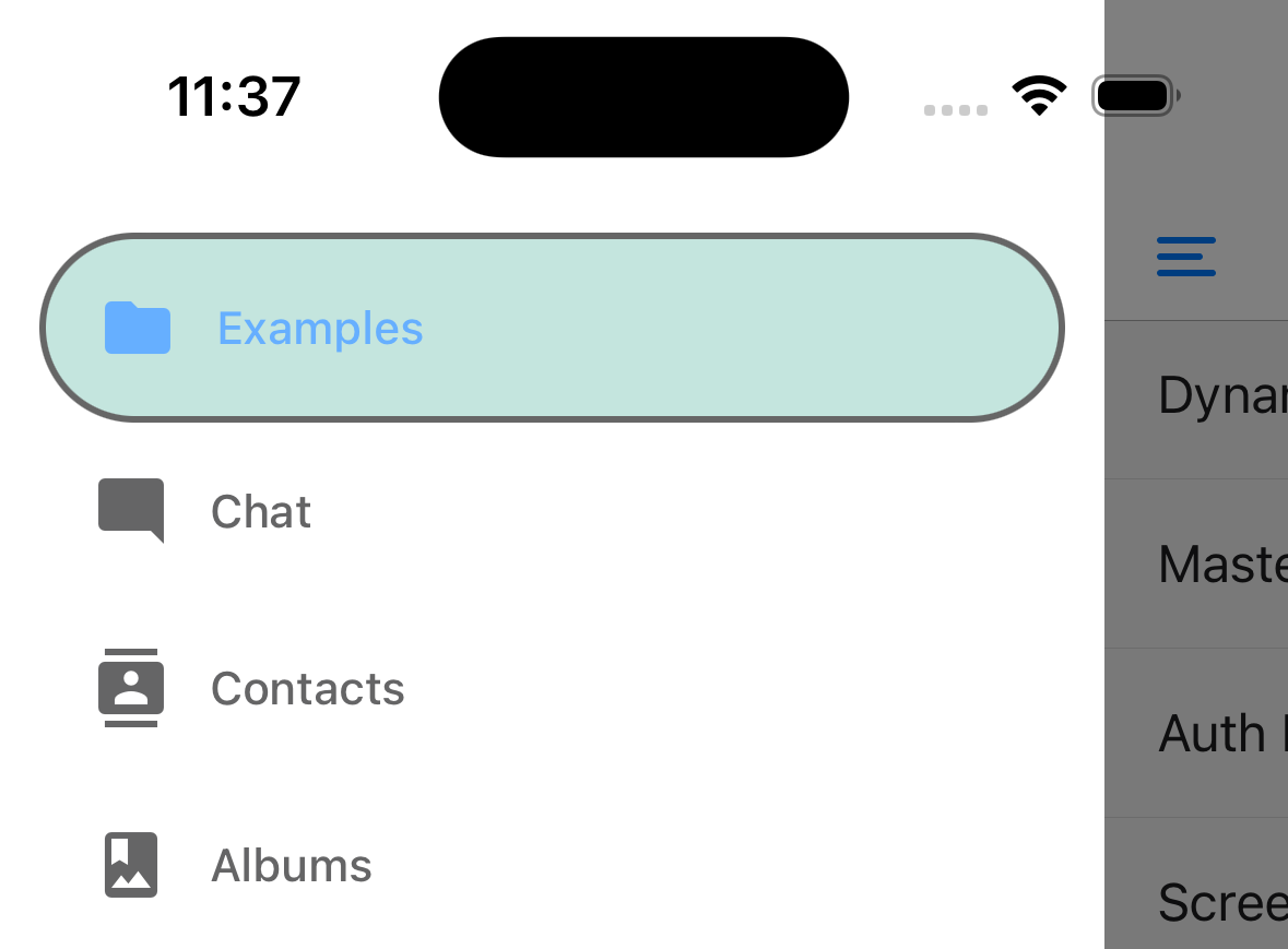
Example:
   drawerItemStyle: {
    backgroundColor: '#9dd3c8',
    borderColor: 'black',
    borderWidth: 2,
    opacity: 0.6,
  },
drawerLabelStyle
Style object to apply to the Text style inside content section which renders a label.
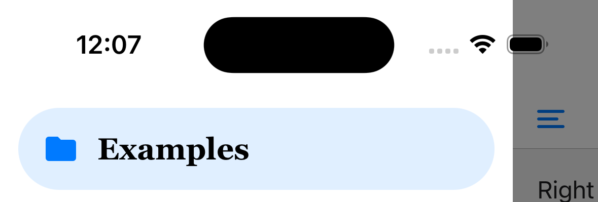
Example:
   drawerLabelStyle: {
      color: 'black',
      fontSize: 20,
      fontFamily: 'Georgia',
    },
drawerContentContainerStyle
Style object for the content section inside the ScrollView.
drawerContentStyle
Style object for the wrapper view.
drawerStyle
Style object for the drawer component. You can pass a custom background color for a drawer or a custom width here.
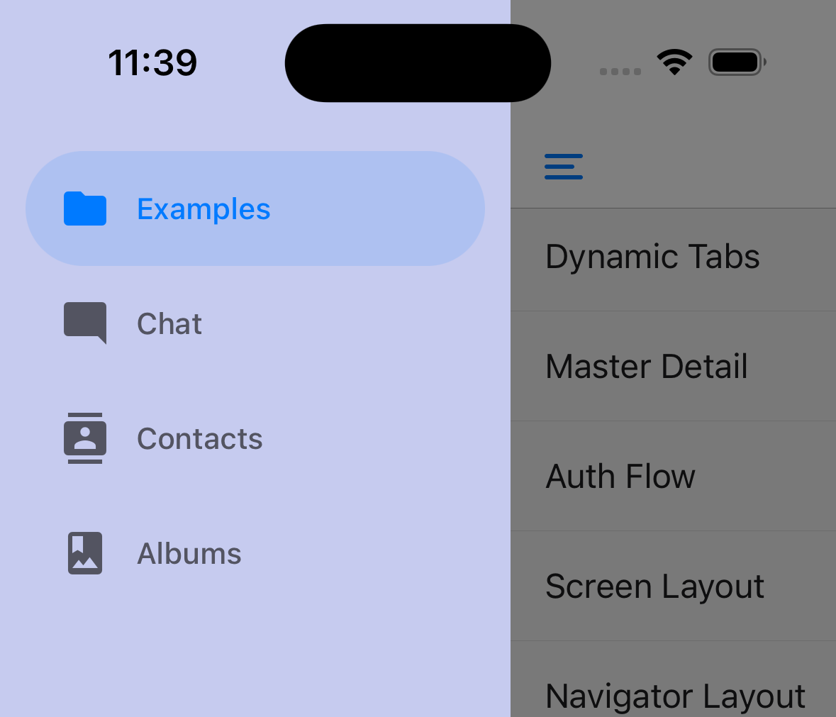
<Drawer.Navigator
  screenOptions={{
    drawerStyle: {
      backgroundColor: '#c6cbef',
      width: 240,
    },
  }}
>
  {/* screens */}
</Drawer.Navigator>
drawerPosition
Options are left or right. Defaults to left for LTR languages and right for RTL languages.
drawerType
Type of the drawer. It determines how the drawer looks and animates.
-
front: Traditional drawer which covers the screen with an overlay behind it. -
back: The drawer is revealed behind the screen on swipe. -
slide: Both the screen and the drawer slide on swipe to reveal the drawer. -
permanent: A permanent drawer is shown as a sidebar. Useful for having always visible drawer on larger screens.
Defaults to slide on iOS and front on other platforms.
You can conditionally specify the drawerType to show a permanent drawer on bigger screens and a traditional drawer drawer on small screens:
import { useWindowDimensions } from 'react-native';
import { createDrawerNavigator } from '@react-navigation/drawer';

const Drawer = createDrawerNavigator();

function MyDrawer() {
  const dimensions = useWindowDimensions();

  return (
    <Drawer.Navigator
      screenOptions={{
        drawerType: dimensions.width >= 768 ? 'permanent' : 'front',
      }}
    >
      {/* Screens */}
    </Drawer.Navigator>
  );
}
You can also specify other props such as drawerStyle based on screen size to customize the behavior. For example, you can combine it with defaultStatus="open" to achieve a master-detail layout:
import { useWindowDimensions } from 'react-native';
import { createDrawerNavigator } from '@react-navigation/drawer';

const Drawer = createDrawerNavigator();

function MyDrawer() {
  const dimensions = useWindowDimensions();

  const isLargeScreen = dimensions.width >= 768;

  return (
    <Drawer.Navigator
      defaultStatus="open"
      screenOptions={{
        drawerType: isLargeScreen ? 'permanent' : 'back',
        drawerStyle: isLargeScreen ? null : { width: '100%' },
        overlayColor: 'transparent',
      }}
    >
      {/* Screens */}
    </Drawer.Navigator>
  );
}
drawerHideStatusBarOnOpen
When set to true, Drawer will hide the OS status bar whenever the drawer is pulled or when it's in an "open" state.
drawerStatusBarAnimation
Animation of the statusbar when hiding it. use in combination with drawerHideStatusBarOnOpen.
This is only supported on iOS. Defaults to slide.
Supported values:
-
slide -
fade -
none
overlayColor
Color overlay to be displayed on top of the content view when drawer gets open. The opacity is animated from 0 to 1 when the drawer opens.
sceneStyle
Style object for the component wrapping the screen content.
configureGestureHandler
Callback to configure the underlying gesture from react-native-gesture-handler. It receives the gesture object as an argument:
configureGestureHandler: ({ gesture }) => {
  return gesture.enableTrackpadTwoFingerGesture(false);
},
This is not supported on Web.
swipeEnabled
Whether you can use swipe gestures to open or close the drawer. Defaults to true.
Swipe gesture is not supported on Web.
swipeEdgeWidth
Allows for defining how far from the edge of the content view the swipe gesture should activate.
This is not supported on Web.
swipeMinDistance
Minimum swipe distance threshold that should activate opening the drawer.
keyboardDismissMode
Whether the keyboard should be dismissed when the swipe gesture begins. Defaults to 'on-drag'. Set to 'none' to disable keyboard handling.
freezeOnBlur
Boolean indicating whether to prevent inactive screens from re-rendering. Defaults to false.
Defaults to true when enableFreeze() from react-native-screens package is run at the top of the application.
Only supported on iOS and Android.
popToTopOnBlur
Boolean indicating whether any nested stack should be popped to the top of the stack when navigating away from this drawer screen. Defaults to false.
It only works when there is a stack navigator (e.g. stack navigator or native stack navigator) nested under the drawer navigator.
Header related options
You can find the list of header related options here. These options can be specified under screenOptions prop of Drawer.Navigator or options prop of Drawer.Screen. You don't have to be using @react-navigation/elements directly to use these options, they are just documented in that page.
In addition to those, the following options are also supported in drawer:
header
Custom header to use instead of the default header.
This accepts a function that returns a React Element to display as a header. The function receives an object containing the following properties as the argument:
navigation- The navigation object for the current screen.route- The route object for the current screen.options- The options for the current screenlayout- Dimensions of the screen, containsheightandwidthproperties.
Example:
import { getHeaderTitle } from '@react-navigation/elements';

// ..

header: ({ navigation, route, options }) => {
  const title = getHeaderTitle(options, route.name);

  return <MyHeader title={title} style={options.headerStyle} />;
};
To set a custom header for all the screens in the navigator, you can specify this option in the screenOptions prop of the navigator.
Specify a height in headerStyle
If your custom header's height differs from the default header height, then you might notice glitches due to measurement being async. Explicitly specifying the height will avoid such glitches.
Example:
headerStyle: {
  height: 80, // Specify the height of your custom header
};
Note that this style is not applied to the header by default since you control the styling of your custom header. If you also want to apply this style to your header, use options.headerStyle from the props.
headerShown
Whether to show or hide the header for the screen. The header is shown by default. Setting this to false hides the header.
Events
The navigator can emit events on certain actions. Supported events are:
drawerItemPress
This event is fired when the user presses the button for the screen in the drawer. By default a drawer item press does several things:
- If the screen is not focused, drawer item press will focus that screen
- If the screen is already focused, then it'll close the drawer
To prevent the default behavior, you can call event.preventDefault:
React.useEffect(() => {
  const unsubscribe = navigation.addListener('drawerItemPress', (e) => {
    // Prevent default behavior
    e.preventDefault();

    // Do something manually
    // ...
  });

  return unsubscribe;
}, [navigation]);
If you have custom drawer content, make sure to emit this event.
Helpers
The drawer navigator adds the following methods to the navigation object:
openDrawer
Opens the drawer pane.
- Static
- Dynamic
navigation.openDrawer()
navigation.openDrawer()
closeDrawer
Closes the drawer pane.
navigation.closeDrawer();
toggleDrawer
Opens the drawer pane if closed, closes the drawer pane if opened.
navigation.toggleDrawer();
jumpTo
Navigates to an existing screen in the drawer navigator. The method accepts the following arguments:
name- string - Name of the route to jump to.params- object - Screen params to pass to the destination route.
- Static
- Dynamic
navigation.jumpTo('Profile', { owner: 'Satya' })
navigation.jumpTo('Profile', { owner: 'Satya' })
Hooks
The drawer navigator exports the following hooks:
useDrawerProgress
This hook returns the progress of the drawer. It is available in the screen components rendered by the drawer navigator as well as in the custom drawer content.
The progress object is a SharedValue that represents the animated position of the drawer (0 is closed; 1 is open). It can be used to animate elements based on the animation of the drawer with Reanimated:
- Static
- Dynamic
import {
  createDrawerNavigator,
  useDrawerProgress,
} from '@react-navigation/drawer';
import Animated, { useAnimatedStyle } from 'react-native-reanimated';

function HomeScreen() {
  const progress = useDrawerProgress();

  const animatedStyle = useAnimatedStyle(() => ({
    transform: [{ translateX: progress.value * -100 }],
  }));

  return (
    <View style={{ flex: 1, alignItems: 'center', justifyContent: 'center' }}>
      <Animated.View
        style={[
          {
            height: 100,
            aspectRatio: 1,
            backgroundColor: 'tomato',
          },
          animatedStyle,
        ]}
      />
    </View>
  );
}
If you are using class components, you can use the DrawerProgressContext to get the progress value.
The useDrawerProgress hook (or DrawerProgressContext) will return a mock value on Web since Reanimated is not used on Web. The mock value can only represent the open state of the drawer (0 when closed, 1 when open), and not the progress of the drawer.
useDrawerStatus
You can check if the drawer is open by using the useDrawerStatus hook.
import { useDrawerStatus } from '@react-navigation/drawer';

// ...

const isDrawerOpen = useDrawerStatus() === 'open';
If you can't use the hook, you can also use the getDrawerStatusFromState helper:
import { getDrawerStatusFromState } from '@react-navigation/drawer';

// ...

const isDrawerOpen = getDrawerStatusFromState(navigation.getState()) === 'open';
For class components, you can listen to the state event to check if the drawer was opened or closed:
class Profile extends React.Component {
  componentDidMount() {
    this._unsubscribe = navigation.addListener('state', () => {
      const isDrawerOpen =
        getDrawerStatusFromState(navigation.getState()) === 'open';

      // do something
    });
  }

  componentWillUnmount() {
    this._unsubscribe();
  }

  render() {
    // Content of the component
  }
}
Nesting drawer navigators inside others
If a drawer navigator is nested inside of another navigator that provides some UI, for example, a tab navigator or stack navigator, then the drawer will be rendered below the UI from those navigators. The drawer will appear below the tab bar and below the header of the stack. You will need to make the drawer navigator the parent of any navigator where the drawer should be rendered on top of its UI.